accessibility

Subscribe to all “accessibility” posts via RSS or follow GitHub Changelog on Twitter to stay updated on everything we ship.

~ cd github-changelog
~/github-changelog|main git log main
showing all changes successfully

In June, we released a number of improvements to the GitHub Mobile apps, mostly focusing on accessibility and enhancing existing features.

iOS

  • You can now navigate to GitHub URLs by pasting them into the search bar on the Home tab. This makes it easier to quickly access repositories, issues, and pull requests from the app.
  • You can hide disruptive comments within GitHub discussions, and have added syntax highlighting for Haskell code snippets.
  • Addressed memory leaks when viewing changed pull request files and pinned repositories on user profiles.
  • Enabled opening draft releases without a tag directly within the app.
  • Displayed line counts next to long file names in pull request files changes navigation.
  • Aligned placeholders in comment views to the inputted text.
  • Improved keyboard navigation in the Explore feed to open selected repositories within the app instead of a web browser.
  • Aligned the account selection chevron next to the username in the Profile for accounts without a display name.
  • Scaled the current account login and display name with Dynamic Type on iPad.
  • Enhanced usability by opening the context menu on the first tap of the context button on comments.
  • Resolved issues causing crashes when viewing GIFs within repository source code.
  • Wrapped long URLs in repository profiles onto multiple lines for better readability.
  • Improved VoiceOver functionality by announcing no search results when searching for favorite repositories.
  • Made project single-select field pickers appear as buttons for assistive technologies.
  • Scaled usernames and repository names within headers in profile views with Dynamic Type.
  • Displayed the review author’s name for dismissed review events in the timeline.
  • Enabled expanding or collapsing security vulnerability reference details using VoiceOver within Copilot Chat code blocks.
  • Implemented an error message display when Copilot chat fails to generate a message.
  • Improved accessibility by announcing the role of reason selectors when sending feedback about a Copilot response.
  • Implemented a flash scroll bar indicator for Copilot suggested messages at large font sizes.

Android

  • Updated the name input dialog in the new file creation flow to alert users when attempting to use unsupported recursive paths.
  • Resolved issue where in-app language preferences were not applied to all sections in the issue or pull request screens.
  • Fixed commit id mismatch after updating a branch in pull request screen.
  • Fixed the accessibility role for comment author badges.
  • Improved color contrast and TalkBack in Home and Repository screens.
  • Improved keyboard shortcuts in Projects and Repository screens.
  • Improved keyboard navigation in the Profile screen.
See more

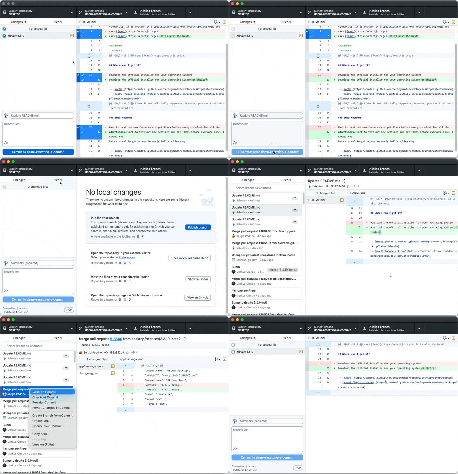
GitHub Desktop 3.4 lets you reset back to a specific commit quickly with “Reset to Commit” and improves discoverability of key application controls.

Resetting to Commit

With Reset to Commit, it takes one click to set your local history back to your latest pushed commit, with all of the reverted changes landing back into your changes list. While similar to using the undo function, Reset to Commit allows for resetting more than one commit at a time. By adding a new way to modify your history, Reset to Commit fits right along side undoing, reverting, amending, squashing, reordering, and cherry-picking features.

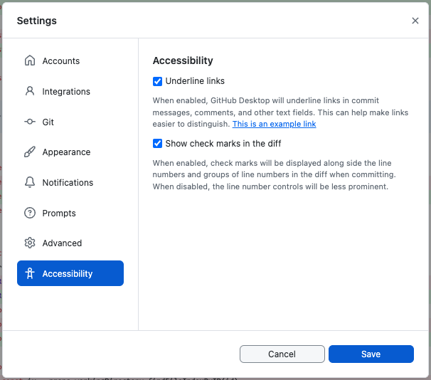
GitHub and the Desktop team are committed to making GitHub Desktop a tool for all developers. With GitHub Desktop 3.4, links are underlined by default and checkmarks are used in the diff to indicate whether a line is selected to be committed. These changes are aimed to enhance discoverability, be keyboard-accessible, and be semantically marked up to enable interaction with assistive technologies.

For users who want to opt out of these changes, check out the new Accessibility settings pane to customize your experience.

Automatic updates will roll out progressively, or you can download the latest GitHub Desktop here.

See more

To enhance accessibility for our users, we have introduced a new accessibility setting that allows the underlining of links within text. It is important that links are clearly distinguishable from the surrounding text, which is achieved not only through color but also through additional styling.

For more information on this feature, please visit our documentation. Thank you for all your valuable feedback during the beta phase.

See more

We are excited to announce a significant update to the comment box used in GitHub issues, discussions, and pull requests, aiming to refine and enhance how you interact and collaborate. This release is a testament to our ongoing efforts to provide an exceptional user experience, making GitHub more intuitive, consistent, and accessible across the platform.

A screenshot of the new comment box

The updated comment box is designed to integrate seamlessly with the existing GitHub environment, ensuring a familiar yet improved experience for all users. Highlights and improvements include:

  • Enhanced User Experience: The newly revamped comment box brings an elevated experience to a wider range of users across various devices. With this update, we've enhanced the responsiveness and streamlined the markup to better accommodate keyboard and screen reader users. This ensures a uniform and smooth user experience across issues, discussions, and pull requests, promoting seamless communication and collaboration.
  • Consistency and Familiarity: Our design philosophy for the new comment box was clear: keep it familiar, make it better. We’ve developed the updated version to closely resemble the original while enhancing it with improved accessibility, consistency, and ease of use across various screen sizes. The transition for you will be smooth, with no disruptions to your workflow.
  • Commitment to Accessibility: This update contributes to our continuous journey to make GitHub more accessible to everyone. The comment box now aligns more closely with our accessibility commitment, enhancing the experience in features such as issues, pull requests, and discussions. Check out our Accessibility Commitment to learn more about how we are making GitHub more inclusive.

We are excited for you to experience the new comment box and we welcome feedback to continue improving GitHub for everyone.

See more

By default, links within text blocks on GitHub are now underlined. This ensures links are easily distinguishable from surrounding text. If preferred, you can "hide" underlines for these links in the accessibility settings. More details can be found in the documentation – managing the appearance of links.

Should you encounter any issues with this feature during its public beta, please provide feedback.

Thanks for aiding our mission to enhance GitHub's accessibility!

See more

To improve accessibility for our users, we've introduced a new accessibility setting to underline links within text blocks. Links should be easily distinguishable from surrounding text, not just by color but by styling. You can now toggle an accessibility setting to either "show" or "hide" underlines for links in text blocks, ensuring clear visibility and differentiation. You can learn more about this functionality in the documentation.

During this public beta phase, your feedback is invaluable. If you spot a link within a text block that isn’t underlined when the setting is enabled, please let us know.

Thank you for supporting our commitment to making GitHub more accessible for everyone!

See more

Many accessibility improvements have been deployed to npmjs.com. Highlights include:

  • Site-wide improvements to color contrast, text resize, and support for users with low vision.
  • Improvements that enable keyboard-only access including visual tracking of the focus indicator.
  • Improved support for assistive technologies including screen readers.

Your feedback is welcome! Please share feedback on the accessibility community discussions page and learn more about GitHub accessibility at accessibility.github.com.

See more

a11y contrast improvement

We improved the color contrast of our default light and dark themes on github.com, making them accessible to all users. These changes were made to Primer, GitHub's Design System, as part of our commitment to making GitHub inclusive to all developers. Visit accessibility.github.com for more information.

The VS Code light and dark themes will also be updated to match these changes.

See more

The contribution graph now supports keyboard interaction and compatibility with assistive technologies. Users can navigate the graph and filter contributions using the keyboard. While navigating the graph, a summary of each day is displayed visually in a tooltip and announced by screen readers.

Image of a Contribution Graph with the contributions done on June 16 showing in a tooltip

Users can move keyboard focus to the contribution graph and then navigate it using the following commands:

  • Press arrow keys to navigate cell by cell
  • Press Page Up to navigate to the first cell in a column
  • Press Page Down to navigate to the last cell in a column
  • Press Home to navigate to the first cell in a row
  • Press End to navigate to the last cell in a row
  • Press Enter to filter content in the Contribution Activity section by the current cell

If the user is running a screen reader, it will announce the following text when the graph receives keyboard focus:

Contribution Graph, table, 54 columns, 8 rows.
User activity over 1 year of time. Each column is one week, with older weeks to the left. Select a cell to filter the "Contribution Activity" section.

When the user navigates to a cell, the screen reader will read a summary such as:

11 contributions on Monday, February 21, 2022.

We are excited to make one of our favorite GitHub features available to more users! If you encounter any issues with these changes, please leave a reply on this feedback discussion.

See more

You can now specify whether to display images for light or dark themes in Markdown, using the HTML <picture> element in combination with the prefers-color-scheme media feature.

For example:

<picture>
  <source media="(prefers-color-scheme: dark)" srcset="https://user-images.githubusercontent.com/25423296/163456776-7f95b81a-f1ed-45f7-b7ab-8fa810d529fa.png">
  <img alt="Shows an illustrated sun in light color mode and a moon with stars in dark color mode." src="https://user-images.githubusercontent.com/25423296/163456779-a8556205-d0a5-45e2-ac17-42d089e3c3f8.png">
</picture>

An animated screenshot of an issue comment that changes the color mode. The content shows an octobiwan in light and stormtroopocat in dark color mode.

See more

A new Tritanopia colorblind theme for blue/yellow color blindness is now available to all github.com users in a public beta. Based on customer feedback, the previous Colorblind theme has been split into two themes: a Protanopia & Deuteranopia colorblind theme, and a Tritanopia colorblind theme. A Protanopia & Deuteranopia colorblind theme is now also available in beta. Navigate to the “Appearance” page in your profile settings to update your theme preferences.

Share feedback


See more

New Protanopia & Deuteranopia colorblind themes for red/green color blindness are now available to all github.com users in a public beta. Based on customer feedback, the previous Colorblind theme has been split into two themes: a Protanopia & Deuteranopia colorblind theme, and a Tritanopia colorblind theme. This Protanopia & Deuteranopia colorblind theme is an update to the previous Colorblind themes. A Tritanopia colorblind theme is now also available in beta. Navigate to the “Appearance” page in your profile settings to update your theme preferences.

Share feedback


See more