Retiring Impact Graphs
Back in April, we launched some amazing new graphs. One of the new visualizations we’ve found especially useful is the contributors page. We’re constantly looking at it to get a…
Back in April, we launched some amazing new graphs.
One of the new visualizations we’ve found especially useful is the
contributors page.
We’re constantly looking at it to get a sense of activity on our projects. It’s
a great way to see who’s contributing and how much of an impact they’re having
relative to other members of a project. The contributors page today is a much
better impact graph than the impact graph ever was.
So today, after four years in service, we’re retiring the impact graph.
Contributors to github
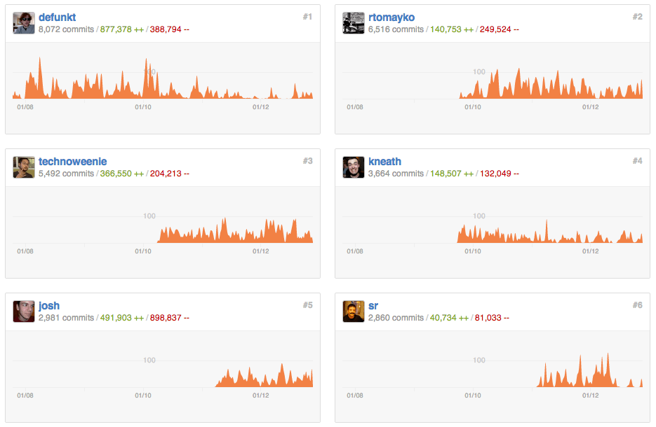
Check out the contributions page of a few of our favorite repositories:
Written by


Related posts

10 technical talks I’m excited about at GitHub Universe 2026
From verifying AI-written code to securing npm dependencies, these are the sessions I’m building my Universe agenda around.

Developer policy update: Transparency, state policy, and what’s ahead
Explore GitHub’s latest transparency data and learn more about policy updates affecting developers and open source.

Developers want more efficient software. Here’s what over 1,000 GitHub users told us they need.
New research from GitHub and Yale Program on Climate Change Communication finds strong demand for tools, measurement, and practical guidance that can help developers reduce wasted compute.