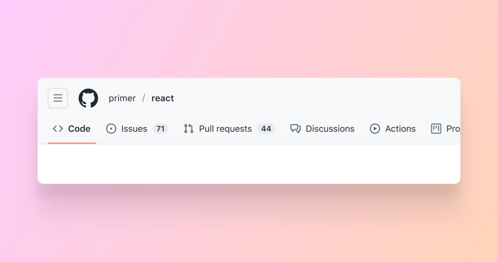
GitHub’s redesigned navigation is enabled for all users as a public beta.
Millions of users build with GitHub every day, and we’re constantly working to make the platform user-friendly, more accessible, and an integral part of your workflow. To that end, GitHub has introduced a brand-new version of the site-wide navigation, redesigned to make it easier to find your way around the site and quickly access your most-used features and functionality.
We know that all types of people build with GitHub every day, from developers to designers, from open source to enterprise, and from learners to skilled engineers. That’s why we’ve built the new navigation with everyone in mind.
We’ve kept the functionality you know and love from the old navigation, while adding some improvements that make it easier to find your way around and faster to find the work you care about.
We improved wayfinding by adding breadcrumbs that reflect the information architecture of every page on GitHub. You can easily determine where you are on GitHub and navigate laterally or vertically in the information hierarchy.

A new site-wide menu contains links to frequently visited areas of the product—like issues, pull requests, and discussions—as well as links to your teams and most-used repositories. Open the site-wide menu by clicking the hamburger button (with three horizontal lines).
Within the site-wide menu, you can filter your repositories and teams.
Crucial links like issues, pull requests, and notifications are always just one click away in the upper-right of each page.

The redesigned navigation integrates code search and the command palette to find and jump to whatever you’re looking for—whether it’s a code snippet, an organization, or another user.
Finally, some things haven’t changed: clicking Mona—the GitHub logo—will take you to the home dashboard, and clicking your avatar will open the user menu.
The navigation was rearchitected to provide you with a more accessible, consistent, and responsive experience across all devices.
We designed the navigation with accessibility in mind and have tested it with assistive technology. GitHub is committed to improving the developer experience for people with disabilities, and the new navigation is an essential part of that experience for virtually everyone. Read more about accessibility features of the new navigation.
Additionally, the navigation is now consistent on every page and responsive for every device size. We improved the mobile experience to ensure you can reliably access and use GitHub features wherever you are.
Finally, we’ve given the navigation a fresh coat of paint with GitHub’s open-source design system, Primer. The navigation leverages the Primer component library, along with Octicons—the Primer icon library. Using Primer guarantees long-term support of the navigation and UI, ongoing accessibility improvements (such as a recent update to the color system), and consistent component styles and behaviors across GitHub.
We’re committed to making GitHub user-friendly and more accessible to everyone, and the new navigation is an exciting step in that direction.
We can’t wait for you to try the new navigation and let us know what you think. To share feedback, please visit the feedback portal.
Note: while in beta, the new navigation can be switched on and off under Global navigation update in Feature preview.


