Unlocking inclusive design: how Primer’s color system is making GitHub.com more inclusive
How Primer’s updated light and dark theme color contrast strategy resolved hundreds of color-contrast-related accessibility issues over one thousand use cases.

Over 100 million developers around the world come to GitHub to build software. Primer, GitHub’s open source design system, is responsible for creating inclusive, responsive and efficient experiences for a diverse range of users. The Primer team aims to enable all user interface (UI) components to be built leveraging Primer. At Primer’s foundation is our color system, a way of defining and applying consistent colors across the Primer UI components and themes. As part of GitHub’s larger accessibility strategy, the Primer Design team committed to improving color contrast in both default light and dark mode. This task is more complex than shifting some hex values in a few components.
The Primer color system has two modes: light and dark. Each mode has several themes, including a default theme, dimmed theme, high contrast theme, and themes for users with color vision deficiencies. Our design systems works with all themes and modes without requiring any extra adjustments.
In order to meet our goal and truly be a home for all developers, we created a color contrast strategy that addresses the hundreds of color contrast issues that were present in Primer. By strategically focusing on our foundations, we were able to make a big impact on improving the accessibility of GitHub.com. This resulted in passing color contrast requirements and resolving hundreds of accessibility issues across more than one thousand use cases. This improvement to the color infrastructure is at the foundation of more exciting and accessible updates coming to GitHub UI. Read on to learn more about how we did it.
Accessibility at the foundation
Our goal was to improve the color contrast of Primer components in both light and dark color modes. We worked efficiently to achieve this by improving accessibility at our foundations through changes to Primer Primitives. Color tokens from Primer Primitives are based on a functional color system that supports multiple color modes and are used to style various elements (text, backgrounds, borders, icons, and more). By focusing on Primer Primitives, we could make color contrast changes in one place and see the updates across all Primer patterns, scaling accessibility improvements to all UI leveraging Primer.

We partnered with the brand team to ensure that the changes we were making were true to GitHub’s brand. At the beginning of this project, we experimented with major adjustments to different parts of the UI in both brightness and hue. However, we chose to scope our changes to accessibility improvements, intentionally leaving larger brand-impacting changes as a separate issue. The plan was to make the smallest possible change to the overall user experience and focus on achieving contrast goals.
Shaping the strategy
Audit
With such a large task ahead, we needed to define a clear strategy. First, we needed to identify both the contrast violations as well as the appropriate levels of Primer’s foundations that we would need to edit. To do this, we performed a comprehensive audit of our Primer primitives. This was a large task in itself, because we had to audit different use cases across all color themes, amounting to hundreds of variations.
Next, we looked at Primer components and how they were using colors. In a system at scale, things can get complicated quickly because the requirements depend on the context and combinations in which colors are used. We immediately identified over 100 color pairs—for example, a text color paired with a background color in use across Primer components. To achieve contrast goals, we needed to ensure these color combinations fulfilled contrast requirements.
Deeply understand the color relationships and WCAG Guidelines
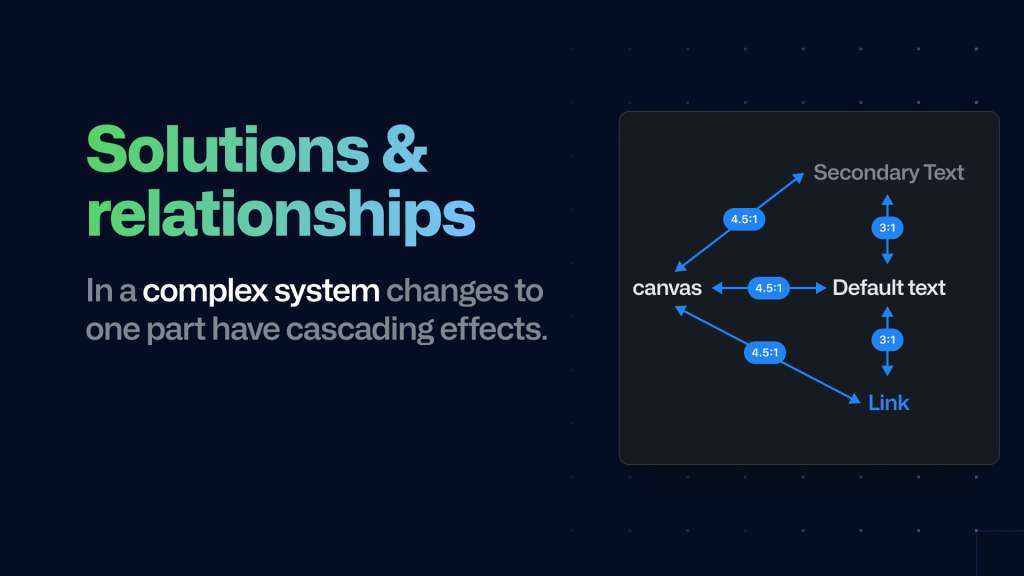
After the audit was completed we had a long list of color pairs with specific contrast requirements. Some colors had more complex relationships as they had to meet a contrast requirement with multiple colors. Our default text is one such example: it not only has to meet the 4.5:1 contrast with the default and muted background, but also a 3:1 contrast with the link color and secondary color. Additionally, colors are often part of multiple color pairs, which means that improving one pair may break the contrast for another.
Manually testing the contrasts began to significantly slow us down. We needed to solve this and we did it the GitHub way: using code and automation.
Codify our learnings to automate for scale
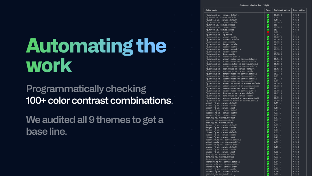
To make our color contrast checks more efficient, we automated the process using a script. Instead of manually testing individual color pairs in Figma, we changed the tokens in the code and created a script that could automatically perform contrast checks for all tokens across all themes.
Once we defined the required contrast ratios for all color pairs, the script generated a table in the command line interface (CLI), which allowed the team to keep track of changes and quickly identify which pairs had passed and failed.
One of the more challenging issues we faced was checking colors with opacity, as the result could vary depending on the background color used. To solve this problem, we created a two-step approach:
First, for every color pair, we checked if the background color was semi-transparent. If it was, we used a blend algorithm to create a solid color with the page background, resulting in generating new color pairs.
Second, for each of those pairs, we checked if the text color was semi-transparent. If it was, we used the same blend algorithm with the now solid background color to create a solid text color.
Leveraging both approaches allowed us to calculate the contrast between the two solid colors
The script significantly improved the team’s work speed, taking only a few seconds to run compared to the time-consuming task of creating and testing each pair individually. We ran the script after making changes, assuring that changing one color contrast did not break another pair. This alleviated our concerns with updates across all color themes.
In fact, this workflow worked so well that we integrated the script as a GitHub action that now runs on every pull request to Primer. If a change is introduced that breaks color contrast, we can catch it before it makes it into production.
Rollout and results
After making contrast changes, the team needed to check if they were working well. We used a tool called a “feature flag” to gradually introduce the changes to some users, testing them before making them available to everyone and ensuring everything was functioning as intended before going live.
We gathered feedback on contrast changes by conducting qualitative user interviews with colleagues from various teams, and observing their reactions with the feature flag enabled. After completing this phase, they enabled the feature flag for all staff and carefully monitored it for a few weeks while collecting feedback.
With a strong focus on our foundations, we were able to make significant strides towards improving the accessibility of GitHub.com, resolving hundreds of accessibility issues across over a thousand use cases. And, of course, to help our designers and developers, we documented everything to ensure that our guidelines, recommendations, and best practices continue to help designers and developers create cohesive, inclusive, responsive, and efficient experiences using our libraries.
Our path ahead
We believe that accessibility should be at the heart of design, and we’re proud to have made such a significant impact on Primer’s accessibility through our work on the color system. We look forward to continuing to make Primer more inclusive for all, so stay tuned for more updates from us!
Tags:


Related posts

The cost of saying yes has changed
The cost of writing code dropped; the cost of owning it didn’t. A framework for deciding which changes are actually cheap in the AI era.
Better tools made Copilot code review worse. Here’s how we actually improved it.
How migrating Copilot code review to shared Unix-style code exploration tools reduced review cost by reshaping agent workflows around pull request evidence.
Automating cross-repo documentation with GitHub Agentic Workflows
Explore how the Aspire team turns merged product changes into SME-reviewed docs pull requests, closing the gap between release and documentation.