Making GitHub’s new homepage fast and performant
This post is the third installment of our five-part series on building GitHub’s new homepage: How our globe is built How we collect and use the data behind the globe…

This post is the third installment of our five-part series on building GitHub’s new homepage:
- How our globe is built
- How we collect and use the data behind the globe
- How we made the page fast and performant
- How we illustrate at GitHub
- How we designed the homepage and wrote the narrative
Creating a page full of product shots, animations, and videos that still loads fast and performs well can be tricky. Throughout the process of building GitHub’s new homepage, we’ve used the Core Web Vitals as one of our North Stars and measuring sticks. There are many different ways of optimizing for these metrics, and we’ve already written about how we optimized our WebGL globe. We’re going to take a deep-dive here into two of the strategies that produced the overall biggest performance impact for us: crafting high performance animations and serving the perfect image.
High performance animation and interactivity
As you scroll down the GitHub homepage, we animate in certain elements to bring your attention to them:

Traditionally, a typical way of building this relied on listening to the scroll event, calculating the visibility of all elements that you’re tracking, and triggering animations depending on the elements’ position in the viewport:
// Old-school scroll event listening (avoid)
window.addEventListener('scroll', () => checkForVisibility)
window.addEventListener('resize', () => checkForVisibility)

function checkForVisibility() {
  animatedElements.map(element => {
    const distTop = element.getBoundingClientRect().top
    const distBottom = element.getBoundingClientRect().bottom
    const distPercentTop = Math.round((distTop / window.innerHeight) * 100)
    const distPercentBottom = Math.round((distBottom / window.innerHeight) * 100)
    // Based on this position, animate element accordingly
  }
}
There’s at least one big problem with an approach like this: calls to getBoundingClientRect() will trigger reflows, and utilizing this technique might quickly create a performance bottleneck.
Luckily, IntersectionObservers are supported in all modern browsers, and they can be set up to notify you of an element’s position in the viewport, without ever listening to scroll events, or without calling getBoundingClientRect. An IntersectionObserver can be set up in just a few lines of code to track if an element is shown in the viewport, and trigger animations depending on its state, using each entry’s isIntersecting method:
// Create an intersection observer with default options, that
// triggers a class on/off depending on an element’s visibility
// in the viewport
const animationObserver = new IntersectionObserver((entries, observer) => {
  for (const entry of entries) {
    entry.target.classList.toggle('build-in-animate', entry.isIntersecting)
  }
});

// Use that IntersectionObserver to observe the visibility
// of some elements
for (const element of querySelectorAll('.js-build-in')) {
  animationObserver.observe(element);
}
Avoiding animation pollution
As we moved over to IntersectionObservers for our animations, we also went through all of our animations and doubled down on one of the core tenets of optimizing animations: only animate the transform and opacity properties, since these properties are easier for browsers to animate (generally computationally less expensive). We thought we did a fairly good job of following this principle already, but we discovered that in some circumstances we did not, because unexpected properties were bleeding into our transitions and polluting them as elements changed state.
One might think a reasonable implementation of the “only animate transform and opacity” principle might be to define a transition in CSS like so:
// Don’t do this
.animated {
  opacity: 0;
  transform: translateY(10px);
  transition: * 0.6s ease;
}

.animated:hover {
  opacity: 1;
  transform: translateY(0);
}
In other words, we’re only explicitly changing opacity and transform, but we’re defining the transition to animate all changed properties. These transitions can lead to poor performance since other property changes can pollute the transition (you may have a global style that changes the text color on hover, for example), which can cause unnecessary style and layout calculations. To avoid this kind of animation pollution, we moved to always explicitly defining only opacity and transform as animatable:
// Be explicit about what can animate (and not)
.animated {
  opacity: 0;
  transform: translateY(10px);
  transition: opacity 0.6s ease, transform 0.6s ease;
}

.animated:hover {
  opacity: 0;
  transform: translateY(0);
}
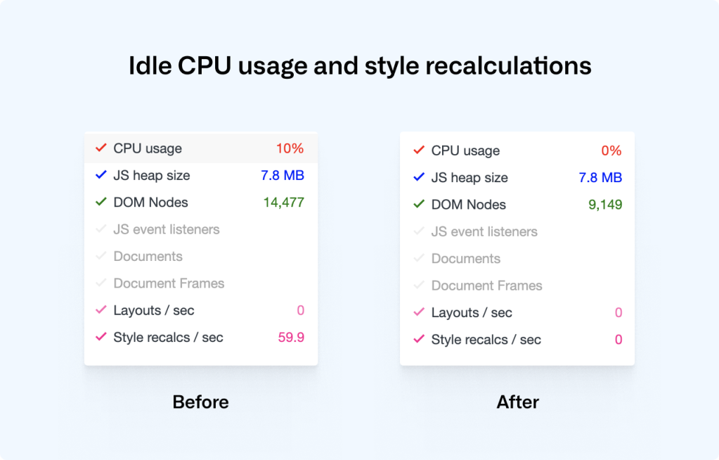
As we rebuilt all of our animations to be triggered through IntersectionObservers and to explicitly specify only opacity and transform as animatable, we saw a drastic decrease in CPU usage and style recalculations, helping to improve our Cumulative Layout Shift score:

Lazy-loading videos with IntersectionObservers
If you’re powering any animations through video elements, you likely want to do two things: only play the video while it’s visible in the viewport, and lazy-load the video when it’s needed. Sadly, the lazy load attribute doesn’t work on videos, but if we use IntersectionObservers to play videos as they appear in the viewport, we can get both of these features in one go:
<!-- HTML: A video that plays inline, muted, w/o autoplay & preload -->
<video loop muted playsinline preload="none" class="js-viewport-aware-video" poster="video-first-frame.jpg">
  <source type="video/mp4" src="video.h264.mp4">
</video>

// JS: Play videos while they are visible in the viewport
const videoObserver = new IntersectionObserver((entries, observer) => {
  for (const entry of entries) entry.isIntersecting ? video.play() : video.pause();
});

for (const element of querySelectorAll('.js-viewport-aware-video')) {
  videoObserver.observe(element);
}
Together with setting preload to none, this simple observer setup saves us several megabytes on each page load.
Serving the perfect image
We visit web pages with a myriad of different devices, screens and browsers, and something simple as displaying an image is becoming increasingly complex if you want to cover all bases. Our particular illustration style also happens to fall between all of the classic JPG, PNG or SVG formats. Take this illustration, for example, that we use to transition from the main narrative to the footer:

To render this illustration, we would ideally need the transparency from PNGs but combine it with the compression from JPGs, as saving an illustration like this as a PNG would weigh in at several megabytes. Luckily, WebP is, as of iOS 14 and macOS Big Sur, supported in Safari on both desktops and phones, which brings browser support up to a solid +90%. WebP does in fact give us the best of both worlds: we can create compressed, lossy images with transparency. What about support for older browsers? Even a new Mac running the latest version of Safari on macOS Catalina can’t render WebP images, so we have to do something.
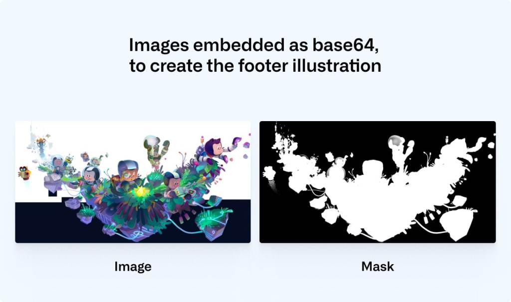
This challenge eventually led us to develop a somewhat obscure solution: two JPGs embedded in an SVG (one for the image data and one for the mask), embedded as base64 data—essentially creating a transparent JPG with one single HTTP request. Take a look at this image. Download it, open it up, and inspect it. Yes, it’s a JPG with transparency, encoded in base64, wrapped in an SVG.
Part of the SVG specification is the mask element. With it, you can mask out parts of an SVG. If we embed an SVG in a document, we can use the mask element in tandem with the image element to render an image with transparency:
<svg viewBox="0 0 300 300">
  <defs>
    <mask id="mask">
      <image width="300" height="300" href="mask.jpg"></image>
    </mask>
  </defs>
  <image mask="url(#mask)" width="300" height="300" href="image.jpg"></image>
</svg>
This is great, but it won’t work as a fallback for WebP. Since the paths for these images are dynamic (see href in the example above), the SVG needs to be embedded inside the document. If we instead save this SVG in a file and set it as the src of a regular img, the images won’t be loaded, and we’ll see nothing.
We can work around this limitation by embedding the image data inside the SVG as base64. There are services online where you can convert an image to base64, but if you’re on a Mac, base64 is available by default in your Terminal, and you can use it like so:
base64 -i <in-file> -o <outfile>Where the in-file is your image of choice, the outfile is a text file where you’ll save the base64 data. With this technique, we can embed the images inside of the SVG and use the SVG as a src on a regular image.
These are the two images that we’re using to construct the footer illustration—one for the image data and one for the mask (black is completely transparent and white is fully opaque):

We convert the mask and the image to base64 using the Terminal command and then paste the data into the SVG:
<svg xmlns="http://www.w3.org/2000/svg" viewBox="0 0 2900 1494">
  <defs>
    <mask id="mask">
      <image width="300" height="300" href="data:image/png;base64,/* your image in base64 */”></image>
    </mask>
  </defs>
  <image mask="url(#mask)" width="300" height="300" href="data:image/jpeg;base64,/* your image in base64 */”></image>
</svg>
You can save that SVG and use it like any regular image. We can then safely use WebP with lazy loading and a solid fallback that works in all browsers:
<picture>
  <source srcset="compressed-transparent-image.webp" type="image/webp">
  <img src="compressed-transparent-image.svg" loading="lazy">
</picture>
This somewhat obscure SVG hack saves us hundreds of kilobytes on each page load, and it enables us to utilize the latest technologies for the browsers and operating systems that support them.
Towards a faster web
We’re working throughout the company to create a faster and more reliable GitHub, and these are some of the techniques that we’re utilizing. We still have a long way to go, and if you’d like to be part of that journey, check out our careers page.
Tags:
Written by
Related posts

How GitHub uses eBPF to improve deployment safety
Learn how Github uses eBPF to detect and prevent circular dependencies in its deployment tooling.

The uphill climb of making diff lines performant
The path to better performance is often found in simplicity.

Continuous AI for accessibility: How GitHub transforms feedback into inclusion
AI automates triage for accessibility feedback, allowing us to focus on fixing barriers—turning a chaotic backlog into continuous, rapid resolutions.