How we designed and wrote the narrative for our homepage
This post is the fifth installment of our five-part series on building GitHub’s new homepage: How our globe is built How we collect and use the data behind the globe…

This post is the fifth installment of our five-part series on building GitHub’s new homepage:
- How our globe is built
- How we collect and use the data behind the globe
- How we made the page fast and performant
- How we illustrate at GitHub
- How we designed the homepage and wrote the narrative
Redesigning GitHub’s homepage required more than just a visual refresh—we had to fundamentally reimagine the story we wanted to share with our community. We faced the challenge of visually conveying both the global scale of our platform, as well as the individual experience of using it. Through a lengthy exploratory phase, we decided to showcase a day in the life of developers as they use GitHub.
Developers interact with GitHub in many ways: writing code, maintaining projects, updating dependencies, reviewing pull requests, working on the go, and so much more. Our homepage needed to speak honestly and directly to the many roles developers play while showcasing the real experience of using GitHub. This blog post provides a behind the scenes look at the design, and the process we used to get there. Spoiler alert: we used GitHub heavily.
Finding an authentic look
We didn’t start from scratch, we iterated. Primer is GitHub’s open source design system for creating all of GitHub’s user interfaces in our product. For years GitHub’s marketing teams have also been building sites using Primer’s components, utilities, and general design principles. But as our marketing design and branding needs evolved, we needed to extend this system to allow our logged-out pages to diverge and better accomplish our vision.
To visualize how we’d do just that, we looked to a series of mood boards to help our teams explore the various directions we could go with our evolving marketing aesthetic. Early visuals involved different brands and themes with the intent to go bold and include some wild ideas to test out aspects of our brand.
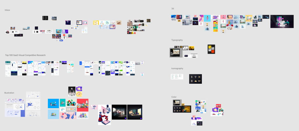
A snapshot of some early brainstorming the team did to help understand which aspects of our brand and design we should hone in.
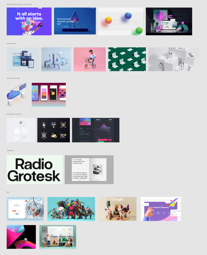
Some of the earlier explorations went in completely new directions for our brand and product. Naturally some went too far and were abandoned, but made for fun and helpful conversations that narrowed feedback.
When it comes to GitHub’s brand, our product has to shine the brightest. So, naturally we had to explore how we showcased our features. Abstract vector recreations, full-sized screenshots, and embedded live examples were all kicked around.
In an early presentation to leadership, we had a captive audience who were very excited about the ideas. However, once the ideas sunk in, they gave us the most direct and kindest feedback possible: “I hate it.” When you’re exploring some wild ideas, it’s bound to happen, and it’s still helpful feedback. Their response obviously encouraged us to rethink our approach. We went back to GitHub’s roots, and it just felt right.
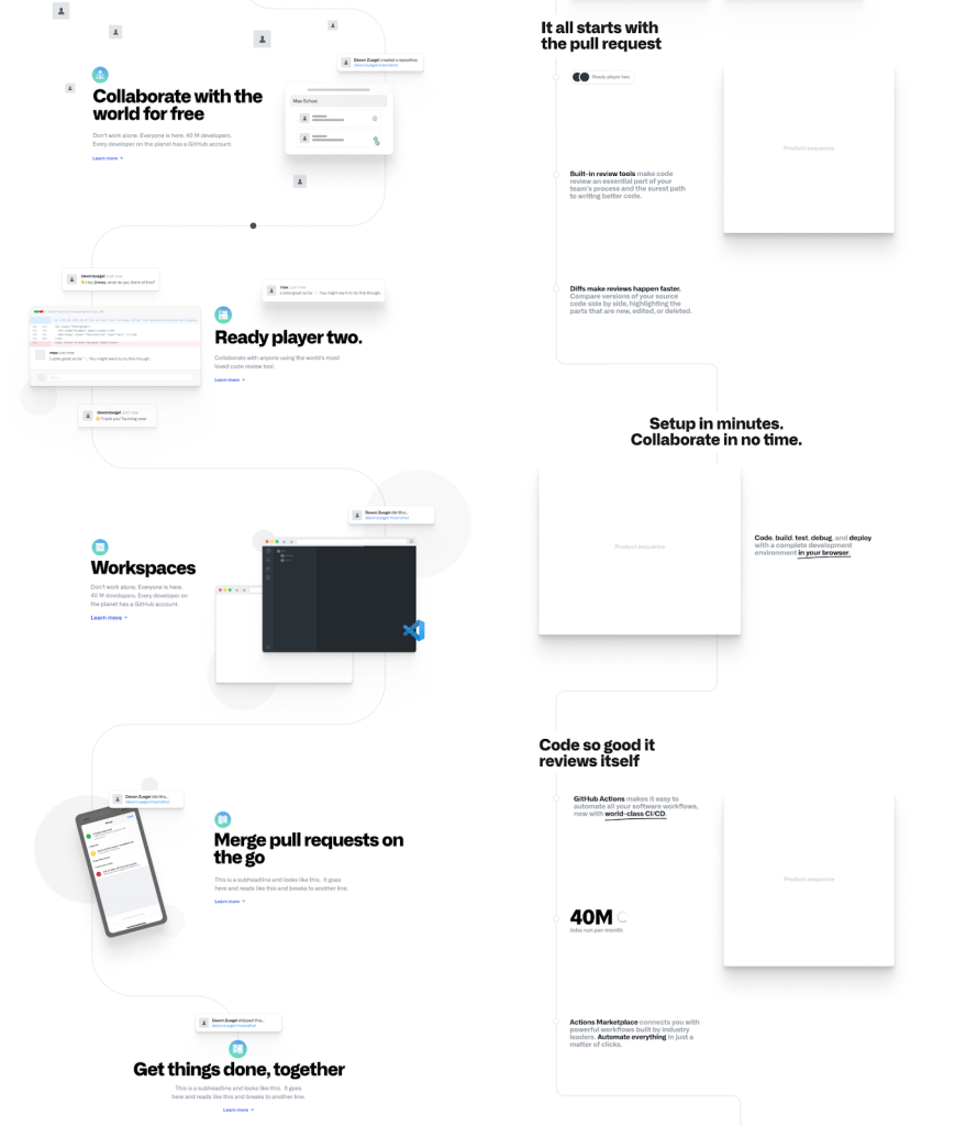
What mattered most to us was showing a high quality, authentic visual representation of our product and story for developers. We settled on using our own in-house expertise to recreate key product interfaces in HTML, CSS, and JavaScript just for our marketing pages. While they omit some small design details here and there, the crux of the feature is immediately clear to developers. We fondly called them accurate vignettes. This ultimately gives developers the subtle nod that we’re on the same team here—you know this, we know this, this is Unix—and allows us to have a ton of fun in bringing our product to life in our marketing.
Similarly, we had to go back to our roots for our handcrafted illustrations. It’d been years since we prominently featured our mascot, Mona the Octocat, on our website, and her octocat friends. We had moved on from these highly detailed illustrative mascots to the easier and faster to produce outline octocats, but along the way, we lost some of the soul and imagination. To really tell our story and the story of developers everywhere, we had to get both the product story and illustrations just right.
As our design, content, and illustration came together, we were able to experiment with how they all work together to make for a more compelling layout.
We also introduced a new typeface, Alliance, to help set the tone for our story. It’s being used on all our new marketing sites and brand initiatives, and even includes an expanded type scale. We even reimagined our color palette, creating a more saturated suite of colors based on our product colors that allowed both illustration and product to coexist seamlessly on the same page. Together, the new typeface and refreshed color palette provide a wide array of stylistic variations that give us the ability to expand our brand in creative yet cohesive ways.
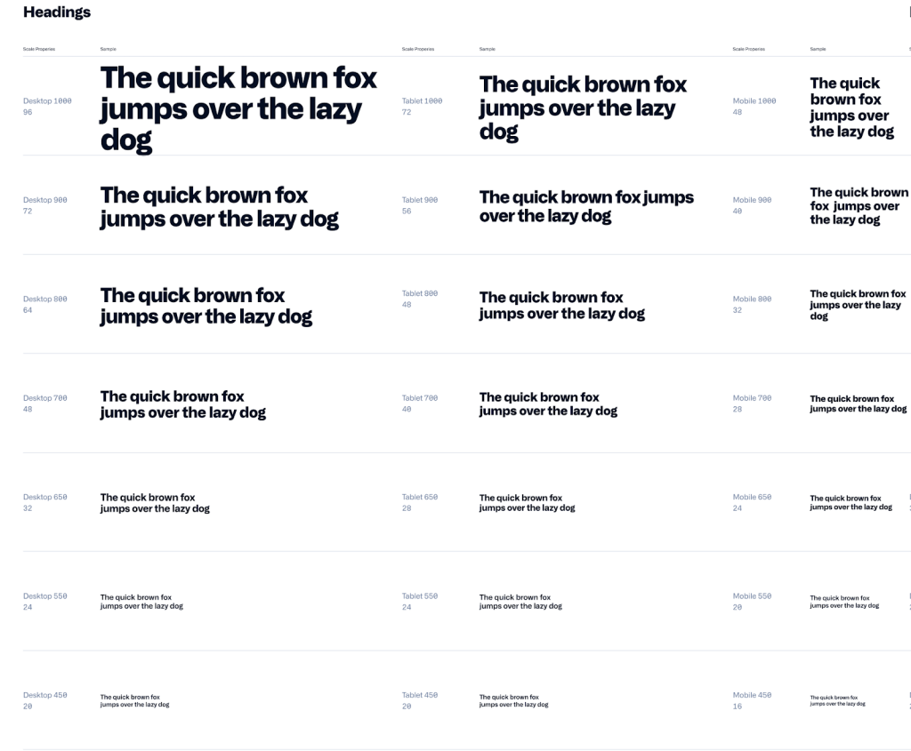
We chose Alliance due to its wide variety of weights and stylistic variants that lend itself well to legibility and flexibility in branding. Here’s a sneak peek of some of the work going into our typescale system.
The tools we use to collaborate
Most of our work happens asynchronously at GitHub, and that was no different with the new homepage project. Our primary tools were Figma, Slack, and GitHub. Figma is the one-stop shop for all our design mockups, templates and components, past iterations, and collecting feedback. We also had a tight group of very talented stakeholders (the primary crew included Product Design: @max , Marketing: @amandaswan, Site Design: @trosage and @tobiasahlin, Brand: @samoshin, @tonyjamarillo, and Content: @mdo) who met weekly for regular status updates. For the larger milestones, GitHub is where we posted final designs, documented decisions, and delegated issues within a project board. And of course, GitHub was our home for all the code and collaboration on development.
At GitHub, our team prototypes in code at a very early stage to validate the design in the actual medium that it will exist. We establish concurrent workflows early, optimizing for tight feedback loops and quick iterations, as opposed to the more standard waterfall style of working common in other marketing teams. Our designers are also developers, and work extensively in GitHub, which leads to a faster tempo, deeper subject matter expertise, and fewer details getting lost in translation between design assets and code.
Designers at GitHub maintain a lot of the frontend code that powers GiHub.com, building and maintaining the design systems like Primer and our expanded marketing system. But they also have experience working in our Rails monolith and working with our APIs. They open and review pull requests alongside engineers, deploy code to production, and even write feature flags that allow us to staff ship features internally for faster testing and tighter feedback loops.
This page reflects a deep knowledge of the product itself and tells a story about how it works. Unlike many tech marketing pages, you can’t drop in screenshots from another product and expect the layout to still make sense. It was uniquely made for GitHub. Our investment in the technologies and people working at the intersection of design and engineering allows us to better tell authentic stories and innovate at scale.
Outlining our narrative
Our story started to really take shape in Markdown outlines. We work in Markdown just about everyday at GitHub with issues, pull requests, and our own documentation. For our new homepage, it really allowed us to look at the major landmarks in our content—the headings and the calls to action (aka, our buttons)—to see the rhythm of our story. It kept our thinking at a high level, despite the low fidelity of plaintext.
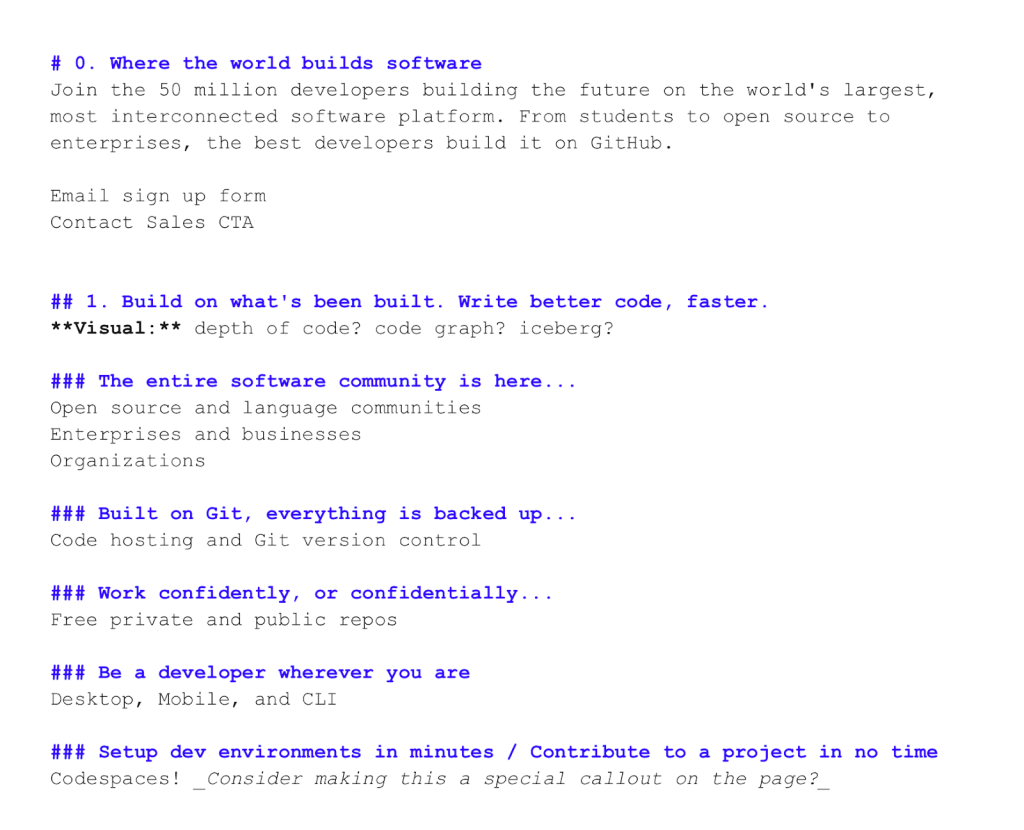
Each heading had to hit the right notes to help frame a really compelling and authentic story about developers’ lives. That meant talking about the foundations of the developer experience—Git, code hosting, open source, and more—and the shiny new features that are augmenting developers’ workflows—Actions, Codespaces, and more. We wrote content that would speak directly to the people visiting our homepage, developer to developer. This meant, don’t water it down with marketing buzzwords—let the features, the visuals, the copy, and the brand do their jobs.
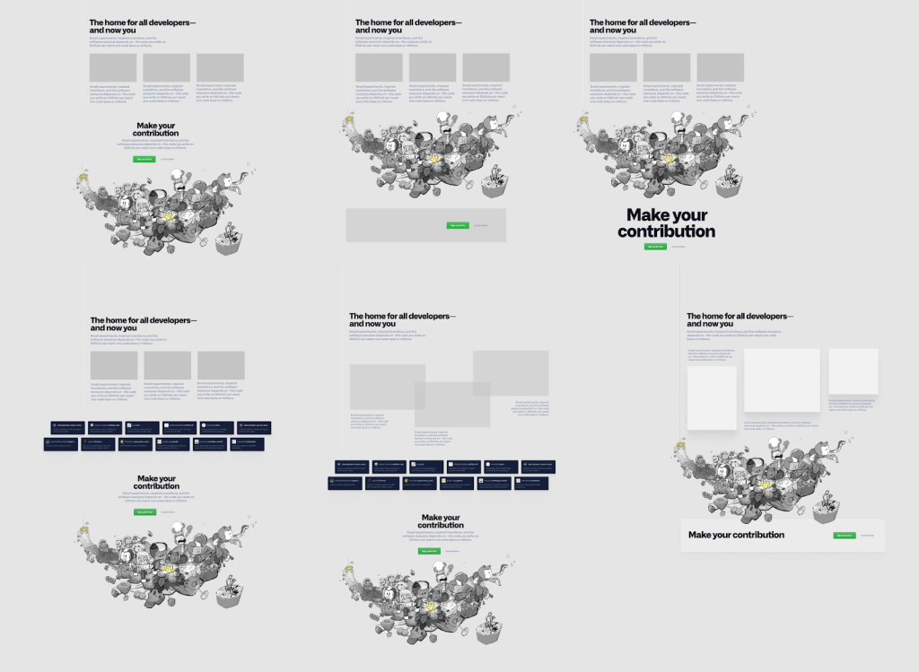
As the designers continued to work on page layout, our content continued to evolve in response—and vice versa. Here’s a mid-fidelity Figma artboard with some early content iterations in pink as suggestions.
As we iterated on the outline, we slowly increased our written fidelity, moving from lists of feature names to full headings and sentences that explain how awesome, powerful, or innovative each feature is on GitHub. As our words took shape, so did the design iterations, kicking off a back-and-forth collaboration across our teams as fidelity increased that ultimately accelerated and amplified our work.
Our design explorations
We took that initial outline of the developer story and started exploring conceptual designs based on the upfront brand work. Our earliest wireframe explorations focused solely on visual examples, layout, and typographic treatments.
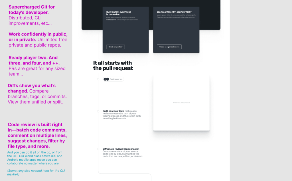
An early illustration of our concept for what later became the interactive globe using pull request data from the GitHub community. Stakeholders fell in love with this concept for communicating GitHub’s global scale and cross-borders collaboration.
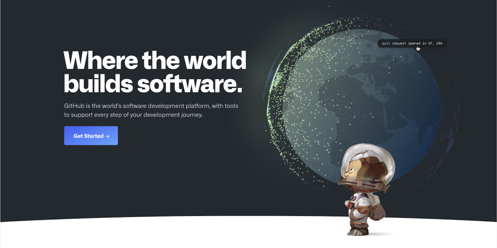
Early explorations showing abstractions of different software packages, some of which are installed into your project as dependencies. Later iterations moved more toward showing real world demos.
We knew we wanted to make each section of the developer story feel like it came to life as visitors scrolled down the homepage. We also knew that the content for the page was long, and we’d have to create visual interest and variance to keep visitors interested. This opened the door for a bold and unique layout that really let the product come to life, while still being based on an underlying design system.
It also gave us the opportunity to create a new animation framework for triggering animations based on scroll position. The result was not only achieving timely visual effects, but also performance gains from not taxing the GPU for animations running outside the viewport.
Some early explorations using the timeline woven throughout the story to highlight milestones in the commit history. We ultimately opted to take a different approach with breaking up the sections to make them more distinct and less repetitive visually.
Pulling it all together
We wanted the first impression to be bold, and that’s why a stunning interactive globe greets every visitor to our homepage. It visualizes the scale of global collaboration that is unique to GitHub—showing real pull requests opening in one country and merging in another. Over 56 million developers and over 3 million organizations from around the world build their software on GitHub.
However, the globe is just the beginning. The rest of the homepage zooms in on some of the daily experiences of our users. Each section is a chapter, telling the story of developers as they use GitHub to do their best work, often wearing different hats.
- Hosting your code on GitHub and building on open source
- Collaborating with developers through pull requests and code review
- New and exciting tools to be your best developer, no matter where you are
- Changing the way we develop with Codespaces
- Automating our problems away with GitHub Actions
- Securing your software before it’s shipped to production
- Being the home for all developers and their many communities
Every section augments and expands on what developers might think is possible through a highly visual, yet distinctly succinct story. Settling on these chapters took some time, but ultimately they reflect the many roles developers play on their teams and our own story.
We also looked to a few moments on the page as record scratches—the times we wanted visitors to do a double take and say, “Wait, what!?”. Those two moments are in the middle of our homepage where we show how developers are working from anywhere with our amazing apps and how Codespaces is nullifying the days long process of setting up a dev environment. Our story is most closely connected to developers here—together we’ve all experienced fundamental shifts in how we write, review, ship, and maintain our software.
Throughout the whole project, we AB tested ideas on the live site to mitigate any risk of negatively impacting sign ups. Our findings from the experiment helped guide our design and narrative as we better understood visitor behaviors, but we didn’t let the data dictate our choices. We made decisions based on our goal of creating an amazing experience for developers and let our values drive the design process.
We had so much fun with this project!
We’re ultimately inspired by all of the work that you do every day, right here on GitHub. Whether it’s a small experiment or a bold invention, we hope that you’re inspired to make a contribution.
GitHub serves a diverse set of developers who collaborate together in many different ways. Distilling all of those individual experiences into a single story that would resonate and inspire developers both new and seasoned was an exciting challenge for our team. It was a long road, but we’re proud of where the homepage landed, and we are looking forward to future iterations.
P.S.
We’re happy to report that the tough feedback we got at the start of the project turned into company-wide positive kudos ✨. Since launching, we’ve seen success in the core KPIs, and we’ve received a wonderful community response. The homepage design has even started to influence other experiences within the product. None of this would have been possible without an incredible team: @trosage, @mdo, @samoshin, @tonyjamarillo, @tobiasahlin, @talsafran, @stefankp, @max, @leereilly.
Tags:
Written by

Related posts

GitHub availability report: June 2026
In June, we experienced six incidents that resulted in degraded performance across GitHub services.
Q1 2026 Innovation Graph update: Open source collaboration is accelerating worldwide
New Innovation Graph data shows global developer communities growing faster than ever, with collaboration reaching new highs across many economies.
GitHub joins coalition advocating for fixes to California AI Transparency Act to protect open source
We’re calling for targeted amendments to resolve conflicts with open source licensing and align with international transparency frameworks while preserving regulatory intent.