How we illustrate at GitHub
In the fourth installment of our five-part series on building GitHub’s new homepage, we’ll explore the artistic pipeline at GitHub to explain story, character and color, and to show how…
In the fourth installment of our five-part series on building GitHub’s new homepage, we’ll explore the artistic pipeline at GitHub to explain story, character and color, and to show how we collaborate across teams to tackle site design.
- How our globe is built
- How we collect and use the data behind the globe
- How we made the page fast and performant
- How we illustrate at GitHub
- How we designed the homepage and wrote the narrative
Collaborative design
On the surface, our new homepage exemplifies the spirit and ingenuity of designers, engineers, and more. But dig a little deeper, and you unlock the interconnected world of software development. There’s plenty to be wowed by, from ourinteractive WebGL globe to character illustrations to mesmerizing product shots. Yet less apparent, it reveals a new way of designing at GitHub. I’m Tony Jaramillo, Design Director at GitHub. Our team is responsible for, among many things, the beloved GitHub mascot, Mona the Octocat. Here’s a peek at our new approach to illustration at GitHub—from idea to ship.
Story
We have a unique opportunity to tell a compelling brand story through design, product, and character IP. To meet this challenge, we’ve combined the talents of our various teams through seamless collaboration. This page was a perfect opportunity to blend our storytelling skills with the site team. We approached the same story from two perspectives: character and UX/UI. From an illustration angle, we viewed the page as a visual narrative explaining the power of GitHub while highlighting our most important asset, the developer.
The origin of the octocat has its mysteries. Still, it’s never strayed from the idea that octocats represent developers. This feline cephalopod species is forever tenacious and searching for something more. Like the human developers they represent, their curiosity fuels this push towards innovation and a better future. This same sentiment is at the core of our branding: whether it’s octocats, conference motion graphics, or office branding, we strive to visually represent the acceleration of human progress that developers drive every day.
So here, we sent our octo-avatar, Mona, on a journey explaining the benefits of GitHub and how we provide the tools needed for any code exploration. Just like her, you too can venture into the unknown with the security of knowing we’ve got your back.
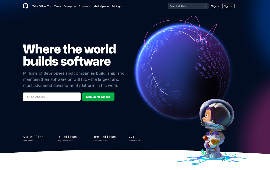
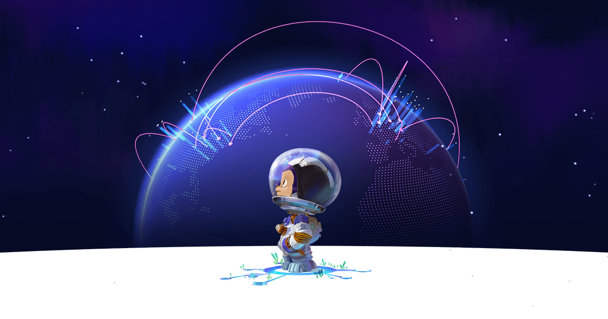
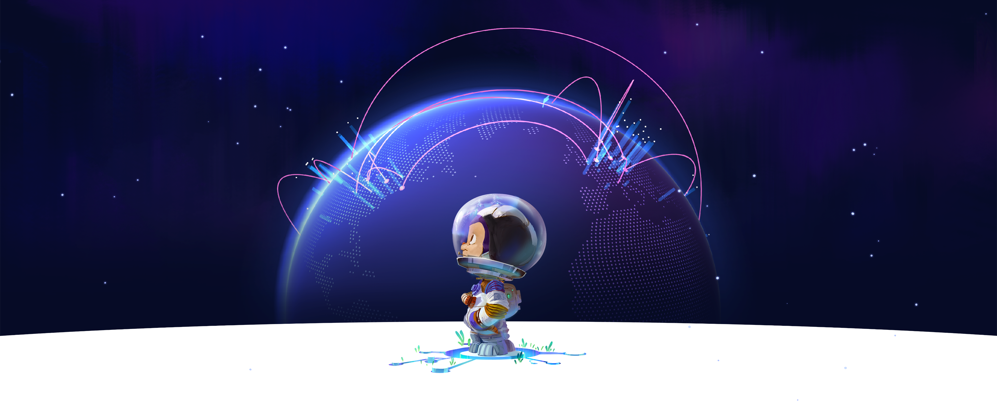
At the start, Mona stands on a blank planet staring at the title, “Where the world builds software.” Behind her is a globe teeming with actual GitHub activity, highlighting the global development community. Earth’s kinetic energy stands juxtaposed against Mona’s potential. The sprouts and Git lines around her feet are hinting at growth and possibility.
As you scroll down the page, we highlight the many features that make GitHub unique. Collaboration, community, automation, and security are just some of the elements we underscore that improve your development workflow, giving you the security and confidence needed to innovate.
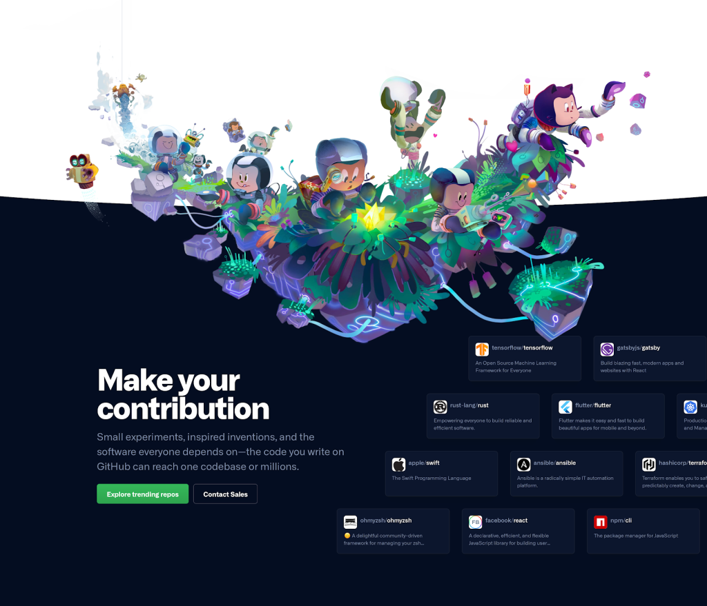
Follow the git line to the footer, and you’ll find a space lander with larger groups of octocats spilling out of it. If humans are the pioneers building the code that transforms our planet, then octocats are the explorers that create physical worlds in their universe. The footer illustration shows that adventurous spirit. The various octocats are surveying the land, utilizing their bots, and working together to create something new. It’s here that we extend a hand to you, the viewer, to ask if you’d like to make a contribution to the community and highlight others who have taken that leap.
Visual development
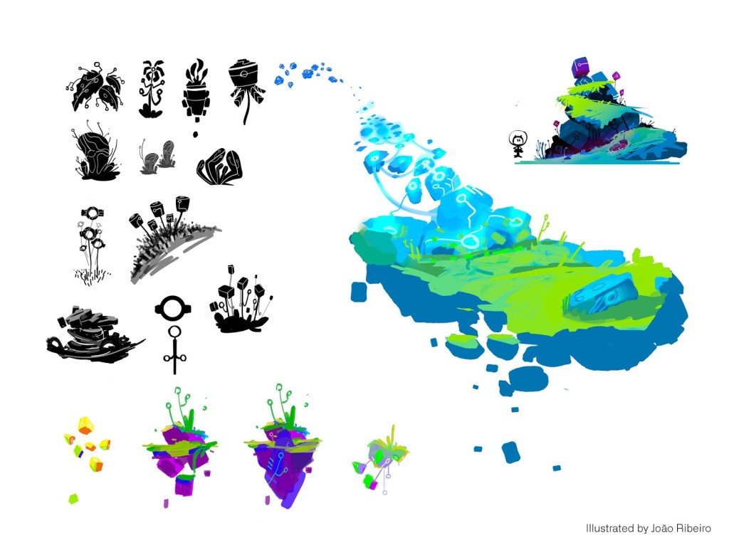
Building is key to the story. To weave the human and Octocat worlds together, we had to develop a common shape language. Git lines were a perfect choice because they’re unique, we can manipulate them into various shapes and sizes, and they’re symbolic for code development. Pushing a commit, submitting a pull request, or creating a new branch, each one of these actions would expand the git line by one node. We felt this symbol was the best example of the metaphorical thread between us. You can find them on rocks, in plants, and more. It’s reminiscent of the expansive fungi networks underneath Earth’s forests.
Illustration
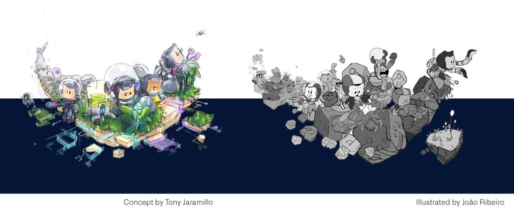
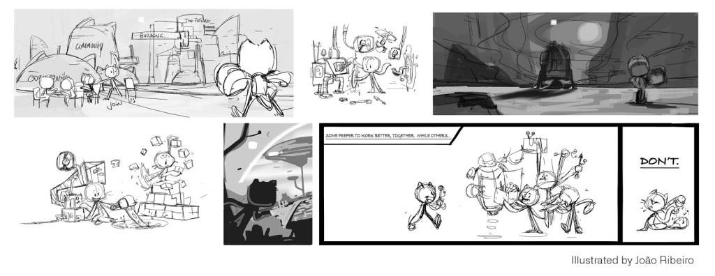
We then used that visual framework to create the various octocat compositions. Our illustration process is straightforward. Thumbnails, concepts, line art, color, and final asset creation, are all based on a shared brief. Our characters are drawn utilizing existing model and expression sheets to ensure consistency. All illustrations were (digitally) hand-painted in-house by our senior artist, João Ribeiro.
It’s worth noting that web illustration poses some additional challenges where elements like responsiveness, performance, and UI layout need to be taken into account. Again, our cross-team collaboration enabled us to work closely with the site team to address these limitations. Specifically, we leveraged their knowledge around compression to improve page performance, which you can read more about in the “Making GitHub’s new homepage fast and performant” post.
Globe
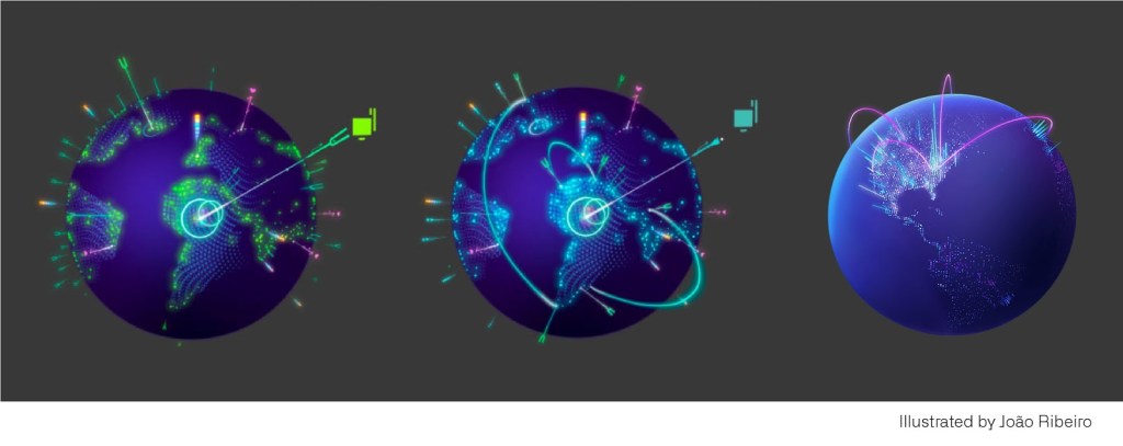
It was imperative to show the actual activity of our development community. We’re proud of our users and jumped at the opportunity to highlight their contributions. The globe design needed to be engaging, informative, and easily legible. It also epitomized the driving force of the Octocat world, so it was essential to make that connection.
To start, our artists created concepts to broadcast this narrative through shape and color. We needed to exemplify the potential of our platform and the wide-reaching expanse of code collaboration. It took multiple iterations to find the right balance. These drawings gave our engineers a baseline to build a dynamic WebGL interactive experience. In the end, this collaborative effort distilled the final product down to its most essential—visual appeal, data visualization, interactivity, and speed.
As a reminder, there are links in the introduction to Tobi and Tal’s blog post about the globe’s creation. I recommend checking them out for a deeper understanding.
Color

Color proved to be a fun challenge. We aim to represent the GitHub UI as accurately as possible in our marketing, so specific UI colors need to be considered. Our product color palettes are designed for utility, of course, but marketing allows us to stretch and flex those fundamentals to provide for a more engaging story.
The core of the visual narrative was energy. We needed a palette that could exemplify the inherent potential of the platform and our community. We iterated by dialing up the saturation without straying too far from our UI hues. It was critical to blend the globe design, character illustrations, typography, and product shots through color.
This new palette is based on a triad—green, violet, and orange. But we needed more options to distinguish each feature section on the page, so we layered a split complementary on top. You may notice a couple of additional “cheat colors,” which again were needed for UI.
Afterward, we developed color scripts to treat the page as a narrative arc to carry the viewer throughout. The header sets the framework for our triad by using those dominant colors on the focal elements—the orange tones on Mona’s face, the violet on the globe, and the green CTA button. As we roll down the page, we rotate around the color wheel using dedicated sections of the palette to define each area visually. The footer then resolves the page by anchoring back into the primary triad colors again.
Going forward
This mix of art + design + engineering represents a new way of telling our brand story. It’s pushed us into new realms of exploration and experimentation, and our collective design toolbox just grew exponentially. I think we’re onto something, and this is just the beginning.
Also, just a reminder about our homepage wallpapers. Make sure you take a piece of the octocat world with you.
- 4K UHD 16:9 Footer
- 4K Ultrawide 21:9 Footer
- 4K Superwide 32:9 Footer
- 4K Superwide 32:9 Header
- 4k UHD 16:9 Header
- 4K Ultrawide 21:9 Header
Tags:
Written by

Related posts
How GitHub engineers tackle platform problems
Our best practices for quickly identifying, resolving, and preventing issues at scale.
GitHub Issues search now supports nested queries and boolean operators: Here’s how we (re)built it
Plus, considerations in updating one of GitHub’s oldest and most heavily used features.
Design system annotations, part 2: Advanced methods of annotating components
How to build custom annotations for your design system components or use Figma’s Code Connect to help capture important accessibility details before development.