How we built the GitHub globe
GitHub is where the world builds software. More than 56 million developers around the world build and work together on GitHub. With our new homepage, we wanted to show how…

GitHub is where the world builds software. More than 56 million developers around the world build and work together on GitHub. With our new homepage, we wanted to show how open source development transcends the borders we’re living in and to tell our product story through the lens of a developer’s journey.
Now that it’s live, we would love to share how we built the homepage-directly from the voices of our designers and developers. In this five-part series, we’ll discuss:
- How our globe is built
- How we collect and use the data behind the globe
- How we made the page fast and performant
- How we illustrate at GitHub
- How we designed the homepage and wrote the narrative
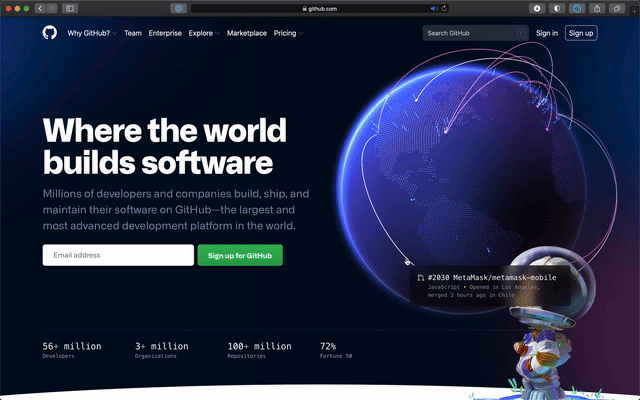
At Satellite in 2019, our CEO Nat showed off a visualization of open source activity on GitHub over a 30-day span. The sheer volume and global reach was astonishing, and we knew we wanted to build on that story.
The main goals we set out to achieve in the design and development of the globe were:
- An interconnected community. We explored many different options, but ultimately landed on pull requests. It turned out to be a beautiful visualization of pull requests being opened in one part of the world and closed in another.
- A showcase of real work happening now. We started by simply showing the pull requests’ arcs and spires, but quickly realized that we needed “proof of life.” The arcs could quite as easily just be design animations instead of real work. We iterated on ways to provide more detail and found most resonance with clear hover states that showed the pull request, repo, timestamp, language, and locations. Nat had the idea of making each line clickable, which really upleveled the experience and made it much more immersive. Read more here.
- Attention to detail and performance. It was extremely important to us that the globe not only looked inspiring and beautiful, but that it performed well on all devices. We went through many, many iterations of refinement, and there’s still more work to be done.
Rendering the globe with WebGL
At the most fundamental level, the globe runs in a WebGL context powered by three.js. We feed it data of recent pull requests that have been created and merged around the world through a JSON file. The scene is made up of five layers: a halo, a globe, the Earth’s regions, blue spikes for open pull requests, and pink arcs for merged pull requests. We don’t use any textures: we point four lights at a sphere, use about 12,000 five-sided circles to render the Earth’s regions, and draw a halo with a simple custom shader on the backside of a sphere.

To draw the Earth’s regions, we start by defining the desired density of circles (this will vary depending on the performance of your machine—more on that later), and loop through longitudes and latitudes in a nested for-loop. We start at the south pole and go upwards, calculate the circumference for each latitude, and distribute circles evenly along that line, wrapping around the sphere:
for (let lat = -90; lat <= 90; lat += 180/rows) {
  const radius = Math.cos(Math.abs(lat) * DEG2RAD) * GLOBE_RADIUS;
  const circumference = radius * Math.PI * 2;
  const dotsForLat = circumference * dotDensity;
  for (let x = 0; x < dotsForLat; x++) {
    const long = -180 + x*360/dotsForLat;
    if (!this.visibilityForCoordinate(long, lat)) continue;

    // Setup and save circle matrix data
  }
}
To determine if a circle should be visible or not (is it water or land?) we load a small PNG containing a map of the world, parse its image data through canvas’s context.getImageData(), and map each circle to a pixel on the map through the visibilityForCoordinate(long, lat) method. If that pixel’s alpha is at least 90 (out of 255), we draw the circle; if not, we skip to the next one.
After collecting all the data we need to visualize the Earth’s regions through these small circles, we create an instance of CircleBufferGeometry and use an InstancedMesh to render all the geometry.
Making sure that you can see your own location
As you enter the new GitHub homepage, we want to make sure that you can see your own location as the globe appears, which means that we need to figure where on Earth that you are. We wanted to achieve this effect without delaying the first render behind an IP look-up, so we set the globe’s starting angle to center over Greenwich, look at your device’s timezone offset, and convert that offset to a rotation around the globe’s own axis (in radians):
const date = new Date();
const timeZoneOffset = date.getTimezoneOffset() || 0;
const timeZoneMaxOffset = 60*12;
rotationOffset.y = ROTATION_OFFSET.y + Math.PI * (timeZoneOffset / timeZoneMaxOffset);
It’s not an exact measurement of your location, but it’s quick, and does the job.
Visualizing pull requests
The main act of the globe is, of course, visualizing all of the pull requests that are being opened and merged around the world. The data engineering that makes this possible is a different topic in and of itself, and we’ll be sharing how we make that happen in an upcoming post. Here we want to give you an overview of how we’re visualizing all your pull requests.
Let’s focus on pull requests being merged (the pink arcs), as they are a bit more interesting. Every merged pull request entry comes with two locations: where it was opened, and where it was merged. We map these locations to our globe, and draw a bezier curve between these two locations:
const curve = new CubicBezierCurve3(startLocation, ctrl1, ctrl2, endLocation);We have three different orbits for these curves, and the longer the two points are apart, the further out we’ll pull out any specific arc into space. We then use instances of TubeBufferGeometry to generate geometry along these paths, so that we can use setDrawRange() to animate the lines as they appear and disappear.
As each line animates in and reaches its merge location, we generate and animate in one solid circle that stays put while the line is present, and one ring that scales up and immediately fades out. The ease out easings for these animations are created by multiplying a speed (here 0.06) with the difference between the target (1) and the current value (animated.dot.scale.x), and adding that to the existing scale value. In other words, for every frame we step 6% closer to the target, and as we’re coming closer to that target, the animation will naturally slow down.
// The solid circle
const scale = animated.dot.scale.x + (1 - animated.dot.scale.x) * 0.06;
animated.dot.scale.set(scale, scale, 1);

// The landing effect that fades out
const scaleUpFade = animated.dotFade.scale.x + (1 - animated.dotFade.scale.x) * 0.06;
animated.dotFade.scale.set(scaleUpFade, scaleUpFade, 1);
animated.dotFade.material.opacity = 1 - scaleUpFade;
Creative constraints from performance optimizations
The homepage and the globe needs to perform well on a variety of devices and platforms, which early on created some creative restrictions for us, and made us focus extensively on creating a well-optimized page. Although some modern computers and tablets could render the globe at 60 FPS with antialias turned on, that’s not the case for all devices, and we decided early on to leave antialias turned off and optimize for performance. This left us with a sharp and pixelated line running along the top left edge of the globe, as the globe’s highlighted edge met the darker color of the background:

This encouraged us to explore a halo effect that could hide that pixelated edge. We created one by using a custom shader to draw a gradient on the backside of a sphere that’s slightly larger than the globe, placed it behind the globe, and tilted it slightly on its side to emphasize the effect in the top left corner:
const halo = new Mesh(haloGeometry, haloMaterial);
halo.scale.multiplyScalar(1.15);
halo.rotateX(Math.PI*0.03);
halo.rotateY(Math.PI*0.03);
this.haloContainer.add(halo);

This smoothed out the sharp edge, while being a much more performant operation than turning on antialias. Unfortunately, leaving antialias off also produced a fairly prominent moiré effect as all the circles making up the world came closer and closer to each other as they neared the edges of the globe. We reduced this effect and simulated the look of a thicker atmosphere by using a fragment shader for the circles where each circle’s alpha is a function of its distance from the camera, fading out every individual circle as it moves further away:
if (gl_FragCoord.z > fadeThreshold) {
  gl_FragColor.a = 1.0 + (fadeThreshold - gl_FragCoord.z ) * alphaFallOff;
}
Improving perceived speed
We don’t know how quickly (or slowly) the globe is going to load on a particular device, but we wanted to make sure that the header composition on the homepage is always balanced, and that you got the impression that the globe loads quickly even if there’s a slight delay before we can render the first frame.
We created a bare version of the globe using only gradients in Figma and exported it as an SVG. Embedding this SVG in the HTML document adds little overhead, but makes sure that something is immediately visible as the page loads. As soon as we’re ready to render the first frame of the globe, we transition between the SVG and the canvas element by crossfading between and scaling up both elements using the Web Animations API. Using the Web Animations API enables us to not touch the DOM at all during the transition, ensuring that it’s as stutter-free as possible.
const keyframesIn = [
      { opacity: 0, transform: 'scale(0.8)' },
      { opacity: 1, transform: 'scale(1)' }
    ];
const keyframesOut = [
      { opacity: 1, transform: 'scale(0.8)' },
      { opacity: 0, transform: 'scale(1)' }
    ];
const options = { fill: 'both', duration: 600, easing: 'ease' };

this.renderer.domElement.animate(keyframesIn, options);
const placeHolderAnim = placeholder.animate(keyframesOut, options);
placeHolderAnim.addEventListener('finish', () => {
  placeholder.remove();
});
Graceful degradation with quality tiers
We aim at maintaining 60 FPS while rendering an as beautiful globe as we can, but finding that balance is tricky—there are thousands of devices out there, all performing differently depending on the browser they’re running and their mood. We constantly monitor the achieved FPS, and if we fail to maintain 55.5 FPS over the last 50 frames we start to degrade the quality of the scene.
There are four quality tiers, and for every degradation we reduce the amount of expensive calculations. This includes reducing the pixel density, how often we raycast (figure out what your cursor is hovering in the scene), and the amount of geometry that’s drawn on screen—which brings us back to the circles that make up the Earth’s regions. As we traverse down the quality tiers, we reduce the desired circle density and rebuild the Earth’s regions, here going from the original ~12 000 circles to ~8 000:
// Reduce pixel density to 1.5 (down from 2.0)
this.renderer.setPixelRatio(Math.min(AppProps.pixelRatio, 1.5));
// Reduce the amount of PRs visualized at any given time
this.indexIncrementSpeed = VISIBLE_INCREMENT_SPEED / 3 * 2;
// Raycast less often (wait for 4 additional frames)
this.raycastTrigger = RAYCAST_TRIGGER + 4;
// Draw less geometry for the Earth’s regions
this.worldDotDensity = WORLD_DOT_DENSITY * 0.65;
// Remove the world
this.resetWorldMap();
// Generate world anew from new settings
this.buildWorldGeometry();
A small part of a wide-ranging effort
These are some of the techniques that we use to render the globe, but the creation of the globe and the new homepage is part of a longer story, spanning multiple teams, disciplines, and departments, including design, brand, engineering, product, and communications. We’ll continue the deep-dive in this 5-part series, so come back soon or follow us on Twitter @GitHub for all the latest updates on this project and more.
Next up: how we collect and use the data behind the globe.
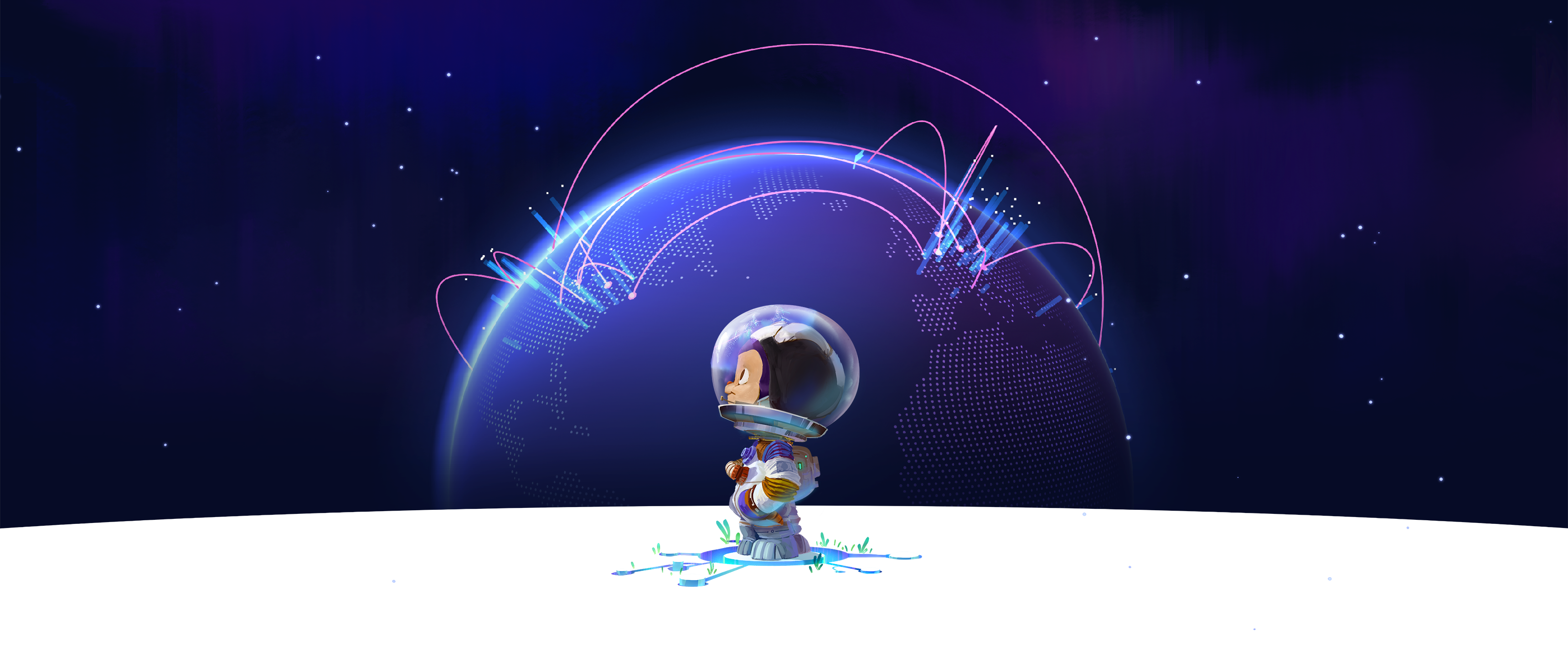
In the meantime, don’t miss out on the new GitHub globe wallpapers from the GitHub Illustration Team to enjoy the globe from your desktop or mobile device:
- 4K UHD 16:9 Footer
- 4K Ultrawide 21:9 Footer
- 4K Superwide 32:9 Footer
- 4K Superwide 32:9 Header
- 4k UHD 16:9 Header
- 4K Ultrawide 21:9 Header
Love the new GitHub homepage or any of the work you see here? Join our team!
Tags:
Written by

Related posts

How GitHub engineers tackle platform problems
Our best practices for quickly identifying, resolving, and preventing issues at scale.
GitHub Issues search now supports nested queries and boolean operators: Here’s how we (re)built it
Plus, considerations in updating one of GitHub’s oldest and most heavily used features.

Design system annotations, part 2: Advanced methods of annotating components
How to build custom annotations for your design system components or use Figma’s Code Connect to help capture important accessibility details before development.