A better logs experience with GitHub Actions
It’s now even easier to review logs from your GitHub Actions workflow runs. We’ve introduced several improvements to make the experience more performant, precise, and pleasing to use. Why these…
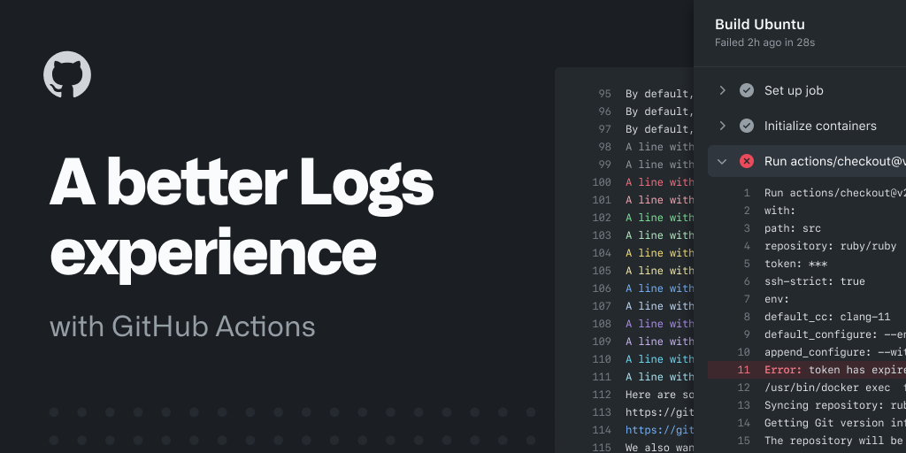
It’s now even easier to review logs from your GitHub Actions workflow runs. We’ve introduced several improvements to make the experience more performant, precise, and pleasing to use.
Why these changes matter
When we think about successful automation, we aim to spend the least amount of time looking at what’s automated, so we can focus our attention on what’s relevant. But sometimes things don’t go as planned, and we are required to review what happened. That debugging process can be frustrating; that’s why we’re introducing a series of changes that will improve both performance and user experience:
- Simplified the layout structure
- Introduced a single and faster virtualized scrolling
- The search is now more responsive
- Better ANSI, 8-bit, and 24-bit color support
- URLs are now interactive
- A new full-screen view mode
- A refreshed UI that improves readability and overall interactions
Because a picture is worth a thousand words, here’s an overview of the changes:

Super-charging the debugging process
The performance gains will make your logs load faster and smoother when scrolling. It’s more apparent in logs with thousands of lines. We also felt it was an excellent time to improve the overall experience, putting a particular emphasis on readability and the interactions to make the UI more responsive and precise.
Let’s dive into these changes.
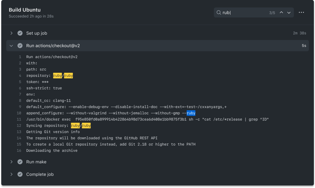
Layout structure and a single scroll
We have established a clear layout structure that enables a quick way to navigate between the jobs while keeping the context of the currently debugging step.

This is especially relevant when logs are dense. We want users to still be able to easily navigate between the different search results while keeping track of the step they are currently focused on.
Improving readability and interactions
All of the elements in the logs now have improved contrast, alignment, accessibility, and overall desktop and mobile interactions.

These additions result in a better reading experience, letting users scan through the logs’ content quickly and find what they are looking for.
The search also received minor visual updates and interaction design updates. Additionally, we’ve improved the performance by defining a threshold that will prevent the system from querying unintentional matches. These gains are especially apparent in content-heavy logs.
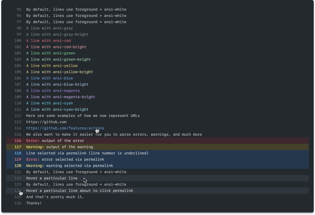
Color is a powerful visual resource, and we wanted to be more mindful of using it to guide you to the right place, so we have redesigned how we use color in our log output. If things go as expected, your logs will look largely the same. If items are in progress, waiting for your input, or even failing, you’ll now be able to quickly locate the item that needs attention and start taking action on your next task.

Opening the door to a more colorful experience
We want to be more mindful about color usage, which means we also need to acknowledge that people build their own scripts, commands, and tools to output useful information.
That’s why we are increasing the color support, including:
- ANSI colors
- 8-bit colors
- 24-bit colors
This enables richer content and better integration when rendering information coming from third-party sources. Here’s a sneak preview of how some of them will look like:
We’d love to hear your thoughts!
At GitHub, we love to hear any feedback you have—share your questions and comments with us in the GitHub Actions Community Forum or if you prefer something more informal, find me on Twitter.
We are pretty excited about these changes, and we can’t wait to hear your thoughts and see what you build with GitHub Actions.
Thanks!
Tags:
Written by

Related posts

GitHub availability report: June 2026
In June, we experienced six incidents that resulted in degraded performance across GitHub services.
Q1 2026 Innovation Graph update: Open source collaboration is accelerating worldwide
New Innovation Graph data shows global developer communities growing faster than ever, with collaboration reaching new highs across many economies.
GitHub joins coalition advocating for fixes to California AI Transparency Act to protect open source
We’re calling for targeted amendments to resolve conflicts with open source licensing and align with international transparency frameworks while preserving regulatory intent.