Introducing the New GitHub Graphs
Translations: Ukrainian. We’ve revamped our existing graphs and added three new graphs to help you discover even more about GitHub hosted repositories. Contributors See who’s contributing to a project and…
Translations: Ukrainian.
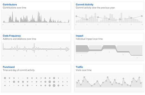
We’ve revamped our existing graphs and added three new graphs to help you discover even more about GitHub hosted repositories.
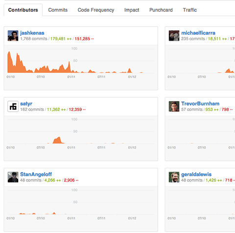
Contributors
See who’s contributing to a project and their contributions relative to other contributors.
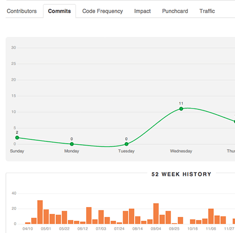
Commit Activity
Commit activity for the past year with a week by week breakdown.
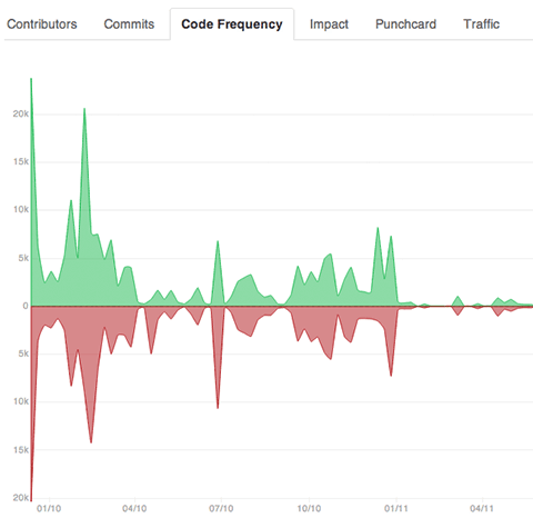
Code Frequency
See additions and deletions over the lifetime of a project.
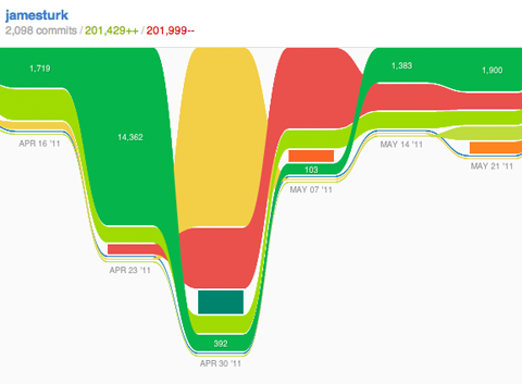
Impact
See individual impact over time. Historical update: The Impact graph is no longer a GitHub feature
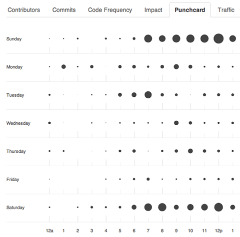
Punchcard
See the hour and day when commits are most frequent.
The new GitHub graphs are built with the amazing d3 library by @mbostock.
Written by

Related posts

GitHub availability report: June 2026
In June, we experienced six incidents that resulted in degraded performance across GitHub services.

Q1 2026 Innovation Graph update: Open source collaboration is accelerating worldwide
New Innovation Graph data shows global developer communities growing faster than ever, with collaboration reaching new highs across many economies.
GitHub joins coalition advocating for fixes to California AI Transparency Act to protect open source
We’re calling for targeted amendments to resolve conflicts with open source licensing and align with international transparency frameworks while preserving regulatory intent.