Introducing the New GitHub Graphs
Translations: Ukrainian. We’ve revamped our existing graphs and added three new graphs to help you discover even more about GitHub hosted repositories. Contributors See who’s contributing to a project and…
Translations: Ukrainian.
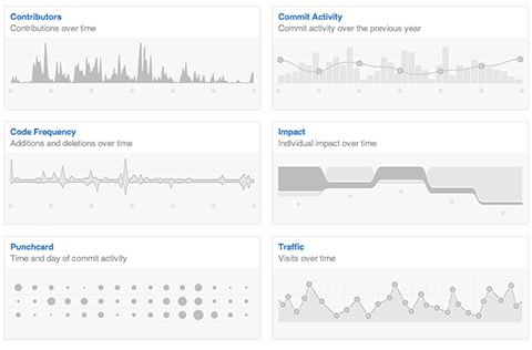
We’ve revamped our existing graphs and added three new graphs to help you discover even more about GitHub hosted repositories.
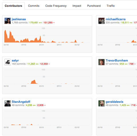
Contributors
See who’s contributing to a project and their contributions relative to other contributors.
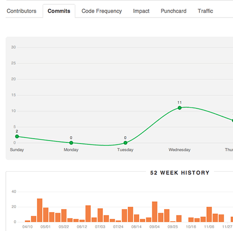
Commit Activity
Commit activity for the past year with a week by week breakdown.
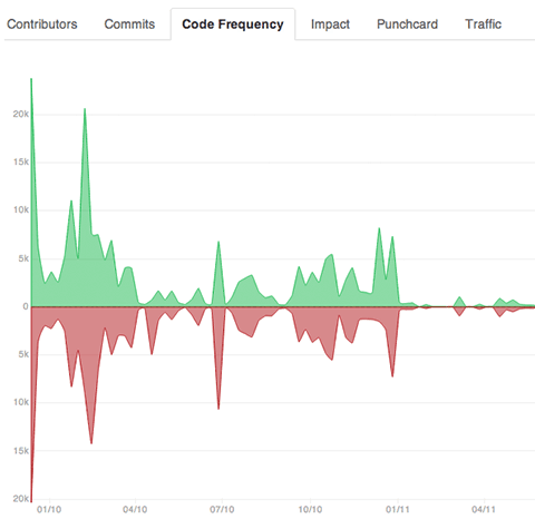
Code Frequency
See additions and deletions over the lifetime of a project.
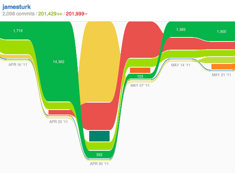
Impact
See individual impact over time. Historical update: The Impact graph is no longer a GitHub feature
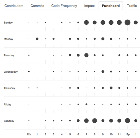
Punchcard
See the hour and day when commits are most frequent.
The new GitHub graphs are built with the amazing d3 library by @mbostock.
Written by

Related posts

GitHub availability report: March 2026
In March, we experienced four incidents that resulted in degraded performance across GitHub services.

GitHub Universe is back: We want you to take the stage
Get inspired by five of the most memorable, magical, and quirky Universe sessions to date.

What’s coming to our GitHub Actions 2026 security roadmap
A look at GitHub Actions’ 2026 roadmap, outlining how secure defaults, policy controls, and CI/CD observability harden the software supply chain end to end.