Impact Graph Speedups
Impact Graphs got a nice upgrade today that has resulted in improved render times (except on the very first load after the recent deploy). Once a graph has been generated,…
Impact Graphs got a nice upgrade today that has resulted in improved render times (except on the very first load after the recent deploy). Once a graph has been generated, subsequent pageloads will simply look up the cached data and send that to your browser. If you load the page and the graph is more than a day old, we’ll fire off a background job that will bring it up to date. With the new data available, subsequent loads will show the newest data. Speedy access for all!
You’ll also notice that this means that you can see the Impact Graph for even very large or old repositories like the Rails graph below.
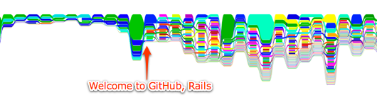
This makes it easy to see how git preserves the author of contributions. Once Rails moved to git and GitHub, their graph explodes with attributed commits. Just another way that git says “I love you.”
Written by

Related posts

GitHub availability report: June 2026
In June, we experienced six incidents that resulted in degraded performance across GitHub services.
Q1 2026 Innovation Graph update: Open source collaboration is accelerating worldwide
New Innovation Graph data shows global developer communities growing faster than ever, with collaboration reaching new highs across many economies.
GitHub joins coalition advocating for fixes to California AI Transparency Act to protect open source
We’re calling for targeted amendments to resolve conflicts with open source licensing and align with international transparency frameworks while preserving regulatory intent.