A new look for repositories
Repositories on GitHub are about to get a brand new look. The new design improves navigation and simplifies page layout, all while improving the code and performance under the hood.…
Repositories on GitHub are about to get a brand new look. The new design improves navigation and simplifies page layout, all while improving the code and performance under the hood. Over the course of the next two weeks, we’ll be rolling out the option to opt-in to the new design from any of your repositories with the click of a button.
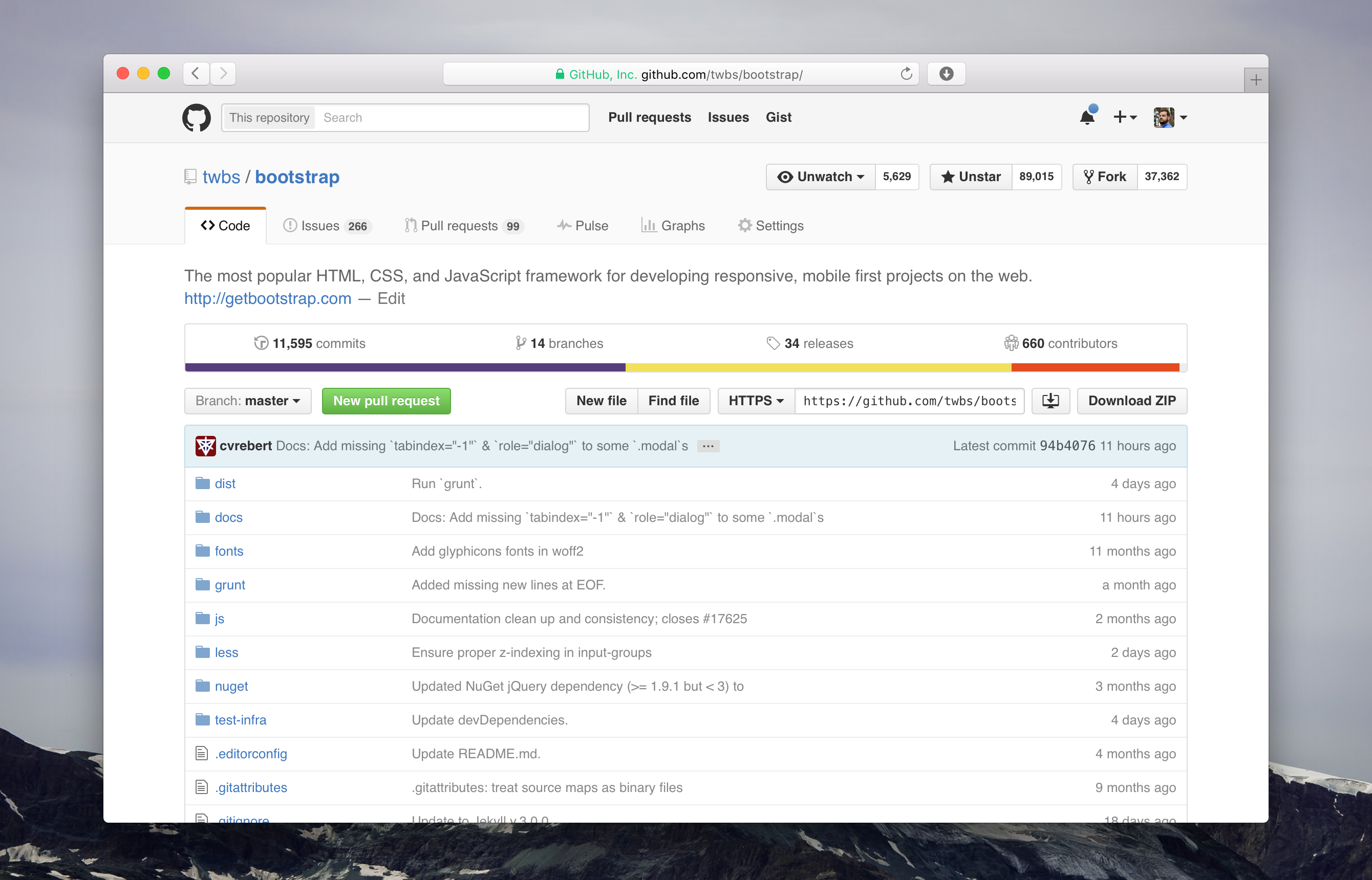
The collapsing side menu is now a single, always present navigation at the top of every page within a repository. This improves accessibility, makes navigating more coherent, and allows you to always see the labels for each tab without requiring tooltips.
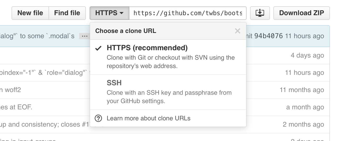
The Code tab now more prominently emphasizes cloning. Clone with confidence using the redesigned protocol switcher, which now contains explicit menu items with explanatory text for each cloning method instead of simple text links.
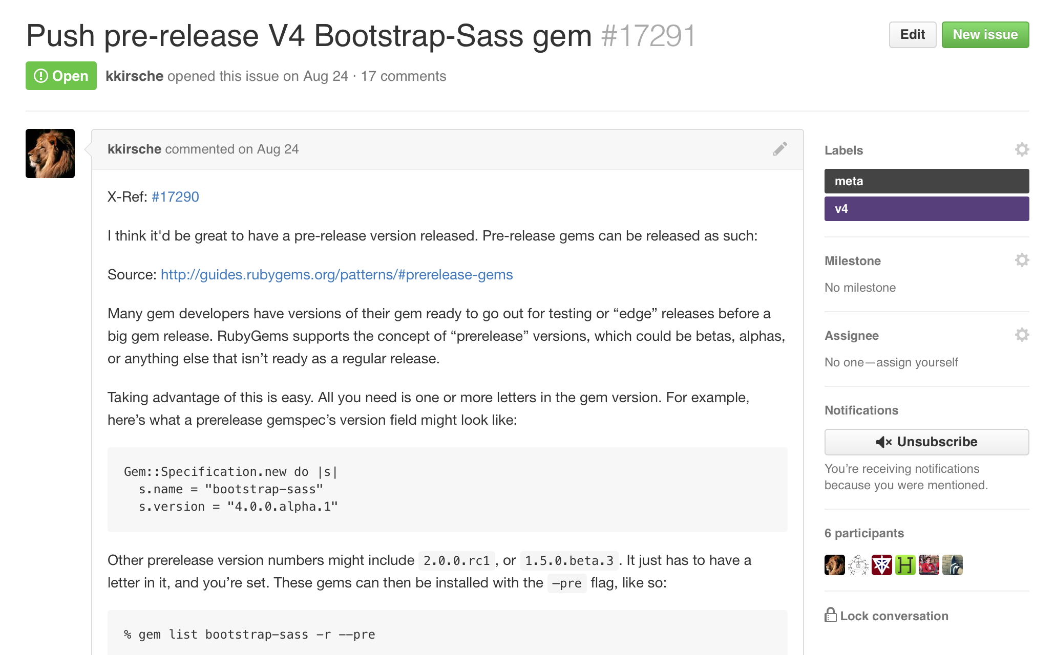
With the navigation at the top, it’s easier to focus on what matters most to you: your content on the page. For example, with the extra horizontal space, issues and pull requests are simpler with a wider and more legible sidebar.
Large changes like this one can be disruptive. To help make the transition as smooth as possible for you, the new design is opt-in for the next two weeks, and after that, you’ll switch over automatically.
We’re super excited to share the new design with you and can’t wait to keep iterating on it moving forward. Enjoy, and happy collaborating!
Written by
Related posts

What’s coming to our GitHub Actions 2026 security roadmap
A look at GitHub Actions’ 2026 roadmap, outlining how secure defaults, policy controls, and CI/CD observability harden the software supply chain end to end.

Updates to GitHub Copilot interaction data usage policy
From April 24 onward, interaction data—specifically inputs, outputs, code snippets, and associated context—from Copilot Free, Pro, and Pro+ users will be used to train and improve our AI models unless they opt out.

GitHub availability report: February 2026
In February, we experienced six incidents that resulted in degraded performance across GitHub services.