Repository Next
Today we’re proud to announce a redesigned repository experience focused on your content, built for everyday use. We’ll be slowly rolling out the ability to opt-in to this new design…
Today we’re proud to announce a redesigned repository experience focused on your content, built for everyday use.
We’ll be slowly rolling out the ability to opt-in to this new design over the next few days. It’s a big change and we don’t want to interrupt you mid-day. Within a couple of weeks this will be the new face of GitHub for everyone.
Optimized for everyday use
GitHub is a product you use every day. We’ve focused on this and optimized for how people interact with GitHub on a daily basis. The next time you click through on a notification email, you’ll find a dramatic reduction of persistent section navigation cluttering up the page.
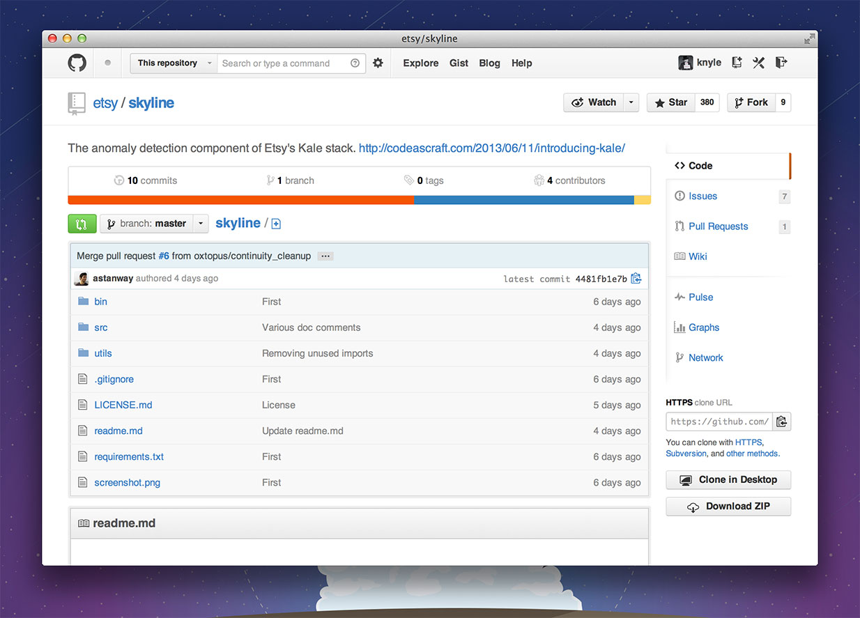
Gone is the large, prominent section of the page dedicated to navigational debris — replaced with a slim, de-emphasized icon-based navigation.
Focus on the context you’re working on and jump to the repository root to switch sections.
The content is the interface
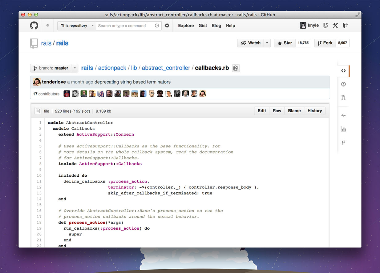
We want the interface to melt away and your content to take center stage. We’ve optimized the design for scanning and reading of your code — your issues — your pull requests. Let your code speak for itself — without tab bars and navigational text competing for attention.
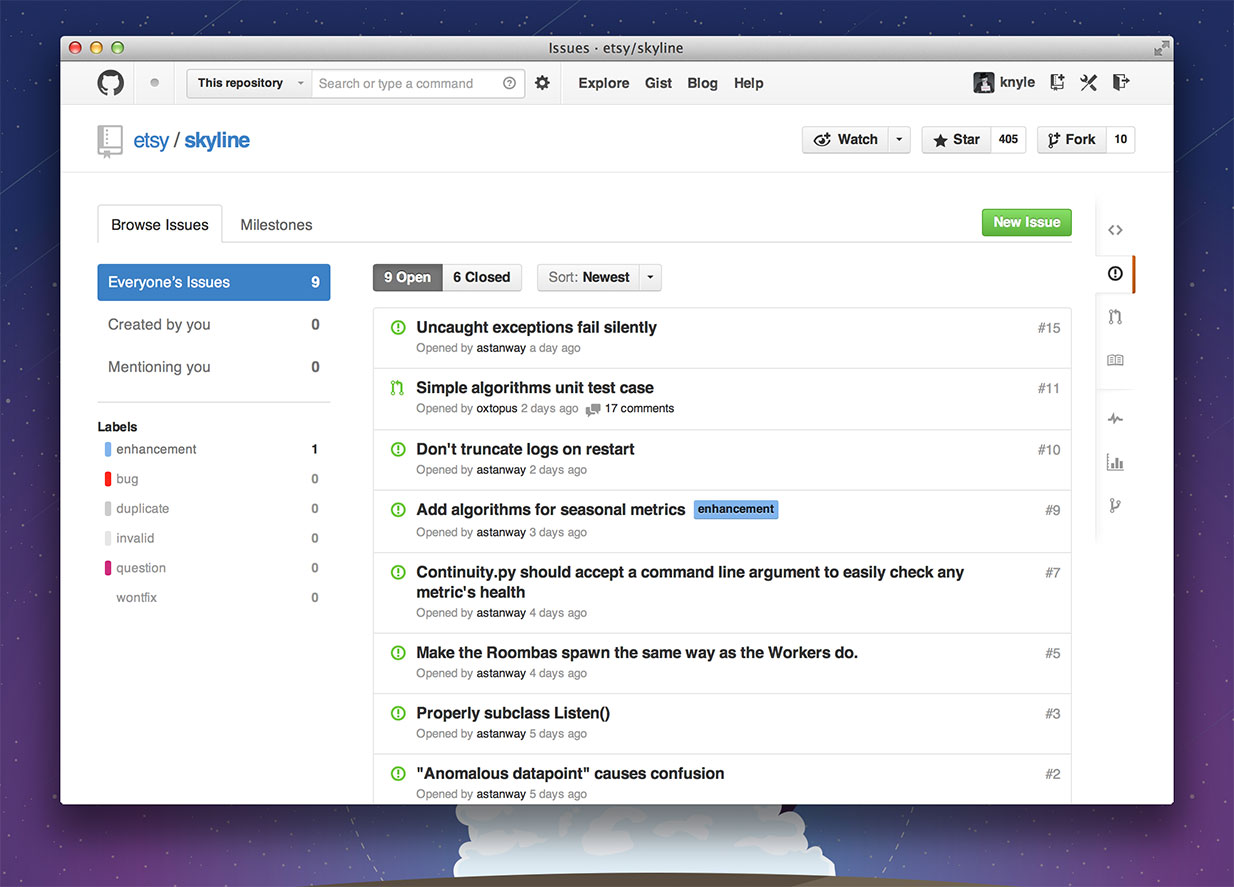
Inside of sections, we’ve replaced many persistent navigation tabs with overviews and content links.
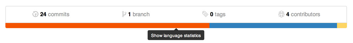

The new repository overview acts as a thumbnail for code — a visual fingerprint for each repository. Click the language bars to see the language breakdown.


If you work across many different repositories, the language bars are a nice way to tell the difference between repository pages, which have a tendency to look exactly the same project to project.
Speed
Responsiveness is one of the most important design aspects of software — so it comes as no surprise that this redesign puts a tremendous focus on speed and responsiveness. We’ve doubled down on pjax and upped our caching game to do everything in our power to reduce page load times.
For many projects on a typical connection, we’ve reduced total navigation time from around 1 second down to 300 milliseconds. We’ve made browsing files within a repository so fast that we no longer need the animations: in most cases, files are rendered nearly instantaneously.
A long time in the making
We’ve been working toward this redesign for almost a year now, and we think it’s a massive step forward in using GitHub.
It’s a big change, and may take a few days to feel right. As always, this is just the beginning. This redesign paves the way for an even faster, more focused GitHub. And we can’t wait to see what the future holds.
Written by

Related posts

GitHub availability report: February 2026
In February, we experienced six incidents that resulted in degraded performance across GitHub services.
Addressing GitHub’s recent availability issues
GitHub recently experienced several availability incidents. We understand the impact these outages have on our customers and are sharing details on the stabilization work we’re prioritizing right now.

GitHub availability report: January 2026
In January, we experienced two incidents that resulted in degraded performance across GitHub services.