Impact Graph Speedups
Impact Graphs got a nice upgrade today that has resulted in improved render times (except on the very first load after the recent deploy). Once a graph has been generated,…
Impact Graphs got a nice upgrade today that has resulted in improved render times (except on the very first load after the recent deploy). Once a graph has been generated, subsequent pageloads will simply look up the cached data and send that to your browser. If you load the page and the graph is more than a day old, we’ll fire off a background job that will bring it up to date. With the new data available, subsequent loads will show the newest data. Speedy access for all!
You’ll also notice that this means that you can see the Impact Graph for even very large or old repositories like the Rails graph below.
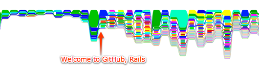
This makes it easy to see how git preserves the author of contributions. Once Rails moved to git and GitHub, their graph explodes with attributed commits. Just another way that git says “I love you.”
Written by

Related posts

What’s coming to our GitHub Actions 2026 security roadmap
A look at GitHub Actions’ 2026 roadmap, outlining how secure defaults, policy controls, and CI/CD observability harden the software supply chain end to end.
Updates to GitHub Copilot interaction data usage policy
From April 24 onward, interaction data—specifically inputs, outputs, code snippets, and associated context—from Copilot Free, Pro, and Pro+ users will be used to train and improve our AI models unless they opt out.

GitHub availability report: February 2026
In February, we experienced six incidents that resulted in degraded performance across GitHub services.