Exploring developer happiness, inclusion, and productivity at GitHub’s Design Conference
As a design organization, we have the opportunity to make a significant impact on designing the platform for all developers. How does the emergence of creative AI impact our work? How can we achieve an inclusive experience for a spectrum of all abilities? What does designing for developer happiness look like?
As a design organization, we have the opportunity to make a significant impact on designing the platform for all developers. How does the emergence of creative AI impact our work? How can we achieve an inclusive experience for a spectrum of all abilities? What does designing for developer happiness look like? These are questions the GitHub Design team asked ourselves in our first-ever internal Design Conference, LGTM.
Why did we call the conference LGTM? LGTM is a common comment on pull requests meaning “looks good to me.” Because we’re constantly influenced by designing for developers and we’ve all approved a pull request or two (or many) with “LGTM 👍!” It has seeped into the very DNA of how we collaborate throughout our team.
Customers are at the center of everything we do on Design. As we aim to fundamentally transform the way people build software, the takeaways from this event reinforced our dedication to delivering a great product for all developers, everywhere.
Designing for productivity and AI
AI is already starting to transform the software development lifecycle, including innovations in the way we design. During the LGTM Design Conference, we explored the opportunities and implications for designers as AI continues to reshape the way we all interact with technology.
We were fortunate to be joined by several talented Design and Engineering leaders, Sally Woellner, Kathryn Gonzalez, and Amelia Wattenberger, in a fireside chat hosted by Martin Woodward. Their conversation touched on the most exciting opportunities unlocked by AI, including new ways to be creative, breaking down barriers for anyone to express their creativity, working alongside design systems to ship consistent output, and saying goodbye to the mundane work we all would rather not do.
Design systems and AI powered design tools are more about helping raise the floor versus limiting the ceiling of what a designer can do. Being able to give more time to the things that do actually give you space to think differently and have more creativity in your work… that’s where we’re going to see more creativity arise.
Perhaps most interesting was the conversation around pushing AI beyond the showy and chat-box oriented ways it’s currently showing up and toward something more transformational and tailored to each person. Across the GitHub Design team, we’ve actively been exploring how this concept might come to life throughout the GitHub platform, whether it’s on pull requests, the dashboard, or GitHub Copilot. AI will certainly enable more innovation and interesting use-cases, and we’re excited to see how it takes shape.
...in many ways the greatest hype is now that the public is super aware of the capabilities of AI and everyone's rallying around it to try and figure out exactly how it fits into our life and what we should be doing with it.
Beyond the fireside chat, our own designers hosted talks on the basics of conversational AI and how to most effectively write prompts and set context to maximize the value of AI’s response. As designers, we are responsible for shaping the experience to deliver a particular intent. Tobias Ahlin pushed further into the theme of leveraging AI to unlock creativity. He used the example of Pablo Picasso’s hyperbolic and dark quote, “I have discovered photography now I can kill myself. I have nothing else to learn,” which we know was far from true. Picasso ultimately pushed art in a direction where photography could not go. We’re now at a critical juncture where creativity will start to look different. And the question is, how? AI tools, such as GitHub Copilot and Midjourney are enabling us to very quickly try out very divergent ideas, explore new problem areas, and are opening new doors for creativity. We’re all at the forefront of exploring this future, and we can positively impact what the journey holds.
It's clear that we won't just see the same thing, and more of it, we'll see something completely new too.
In the end, it’s imperative that we keep putting the customer at the center of everything we do. As we interact with AI and build new AI tools, we need to continue talking about customer needs and jobs to be done.
This is wonderful technology, it's super powerful, mind blowing, and it's important that you still remain focused on what the job is to be done for the user. Think about the technology as another tool to deliver an outcome and the outcome matters more than the technology itself. Next, it's important to think about the context. What data is available? What data would I use or rely on to deliver this particular outcome?
You can watch some of the talks on YouTube:
Designing for everyone
As designers, we aim to create a joyful, usable and productive experience for everyone, including people with disabilities. During the conference, we heard from a diverse group of internal and external accessibility experts, as well as a customer panel of GitHub customers with lived experiences using a variety of assistive technologies. Great accessibility and great design are two sides of the same coin, and more often than not, focusing on inclusive experiences informed by data results in a better experience for everyone.
Christina Mallon reminded us that disability is caused by a mismatch between a person and a human-made experience. It’s the world around us that wasn’t built with disability in mind, and everyone experiences disability at multiple points in their lives.
I only ever feel disabled when I can't do something and when that wasn't designed with accessibility in mind.
Designing complex interactions for users with a wide range of abilities is challenging, and as we learned during the panel, one individual’s needs can even be contradictory to others’. It’s easy to fall into traps where accessibility checks pass but the resulting outcome isn’t a good experience for anyone, especially for those outside of mainstream disabilities. We explored the idea that ability is a spectrum and that universal design, as it currently exists, doesn’t work. Designing for all developers cannot be solved by designing for the average of all people’s experiences.
... we make the biggest mistake of our lives in thinking of accessibility as a dichotomy, where either you're a disabled person or you're not; ability is a spectrum. It's hard to make things that work for everybody at all times. It's difficult, it's really difficult. But, that's not an excuse for us to not start walking towards it. We should start walking towards it.
Technology surfaced as a critical opportunity to create better experiences for people with disabilities. Voice to text options, like GitHub Copilot Voice and Google’s auto-complete functionality, were cited as tools greatly improving efficiency where completing work would otherwise take a long longer with certain disabilities. Catharine McNally, who is deaf, further reinforced the opportunity technology presents by sharing her own hacks, such as using smart lights to flash repeatedly during a tornado watch and using ChatGPT to serve as a homegrown accessibility accommodation for meeting notes. We explored the possibility of leveraging AI and ML to proactively surface accessibility settings to users who exhibit certain behaviors and patterns.
What if instead of users adapting to new systems, the systems started to adapt to the user?
A resounding takeaway was the importance of designing for accessibility and inclusion from the very beginning, with the perspectives of people with disabilities in the room. With the incredible speed at which AI tools are evolving, the industry collectively has an opportunity to be a part of the solution and design the blueprints of accessible AI.
Learn more about GitHub’s commitment to accessibility at https://accessibility.github.com/.
You can watch some of the talks on YouTube:
Designing for joyful developer experiences
GitHub’s Design team is constantly finding new ways to put developers first in everything we do, and one of those ways is sparking joy at the right moments. Sometimes this looks like entirely new and innovative solutions, and sometimes this looks like tiny incremental changes created with a whole lot of passion. We’re fueled by the constant flywheel of feedback from our customers and experiments.
Aja Shamblee led a session on how our Brand and Marketing Design team is drawing inspiration from cinema, and how continual learnings are contributing back to our flywheel to generate momentum and scale. We learned that the recent GitHub Copilot X campaign was inspired by the original poster from Ridley Scott’s Alien!
Every choice in lighting, set design, costume, hair and makeup, even angle shot, is meant to take you into the narrative, build a character, and spur some emotion through visual styles. Cinema as a principle gives us the opportunity to make objective aesthetic choices that evoke very deliberate reactions.
Aja highlighted how these core principles impacted the success of the recent Galaxy and GitHub Copilot X wins and revealed how they are being applied to in-progress Universe explorations. We believe brand is a product. And like any product, brands must evolve, adapt, and shift to highlight the heroes of GitHub, while maintaining a clear connection to our community.
Cameron Foxly expanded on the idea of cinematic storytelling with GitHub’s unique character-centered brand and what we lovingly refer to as “The Octocat Universe.” Here we are, 15 years out from Mona the Octocat’s original appearance, and not only is she still our logo, but she’s deeply loved by the community and her story is constantly evolving and adding new characters. Most recently, GitHub Copilot has emerged as the newest character in the Octocat Universe, and like the AI product it represents, GitHub Copilot is invented by Mona to be her AI assistant, powered by the collective knowledge of the Octocat community. The team is exploring new and interesting ways to bring GitHub Copilot to life across the product through illustration and animation as a way to create moments of joy. It’s been our team’s commitment to storytelling that has kept Mona’s magic alive for so long.
|
|
|
Grace Vorreuter and Jared Bauer from our Customer Research team shared how to measure and quantify delight by going beyond CSAT and NPS to satisfy customers’ emotional needs. We explored the hierarchy of customer needs, focusing on the deep delight that moves products from being good to great.
You can watch some of the talks on YouTube:
Designing a brand for designers, who design for developers
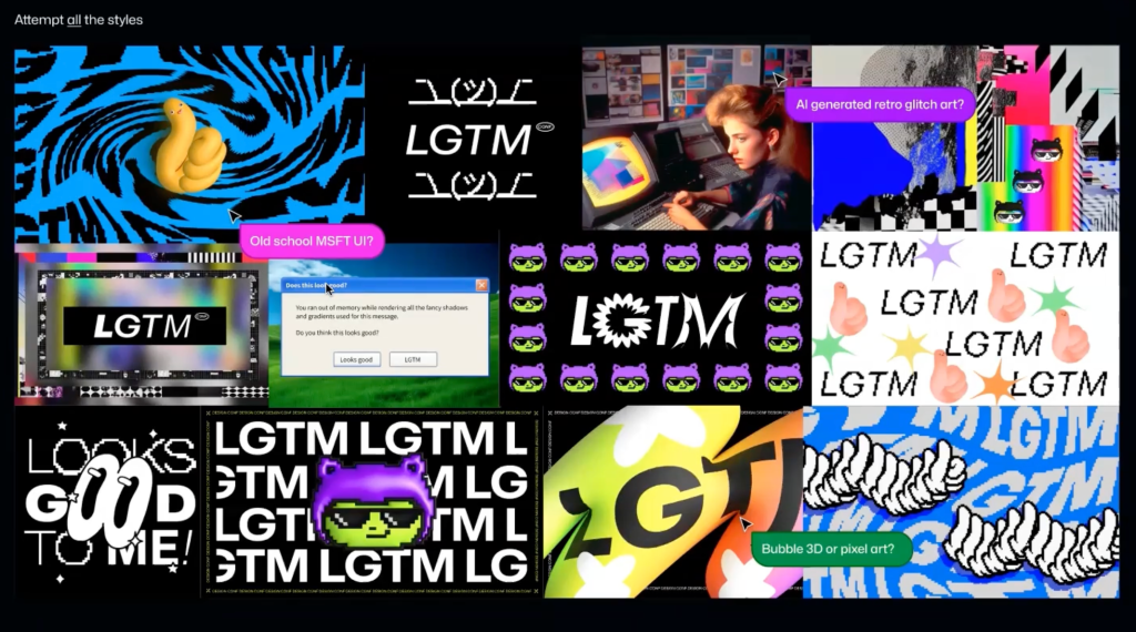
For our first LGTM Design Conference, we wanted to create a unique identity that was accessible, sparked joy, and was “GitHubby” to its core. The Brand team had fun creating everything from motion to slides to merch. Throughout the event, we saw the brand show up in everything from custom Zoom backgrounds to pixel art in Figma.
The team’s discovery process started with developing mild, medium, and hot looks to calibrate and set a direction. This “spice scale” is an integral part of Brand Studio’s process. As they explored various directions, it became clear that a simple thumbs up 👍 would be central to the identity.
Get a behind the scenes look into how the brand was made.
LGTM Design Conference themes and sessions
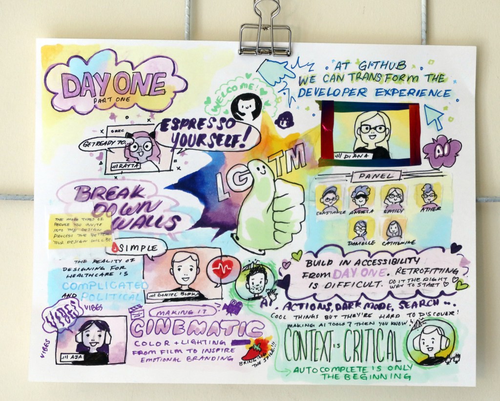
LGTM Design Conference featured 16+ unique sessions across four themes: AI and innovation, accessibility and inclusion, designing for delight, and building GitHub using GitHub. The event had 35+ speakers, including many of our talented Design Hubbers, and we had the pleasure of hosting several external speakers, including Daniel Burka, John Maeda, Kathryn Gonzalez, Sally Woellner, Margaux Joffe, Riley Cran, and Christina Mallon.
You can watch some of the talks on our YouTube playlist.
And, what’s any good conference without swag? The LGTM swag turned out too good not to share, so we made it available to everyone. Visit the GitHub Shop and order your favorite items!
The LGTM Design Conference looked good to us, and we hope it does to you as well.
Tags:
Written by
Related posts

Continuous AI for accessibility: How GitHub transforms feedback into inclusion
AI automates triage for accessibility feedback, allowing us to focus on fixing barriers—turning a chaotic backlog into continuous, rapid resolutions.
How we rebuilt the search architecture for high availability in GitHub Enterprise Server
Here’s how we made the search experience better, faster, and more resilient for GHES customers.
From pixels to characters: The engineering behind GitHub Copilot CLI’s animated ASCII banner
Learn how GitHub built an accessible, multi-terminal-safe ASCII animation for the Copilot CLI using custom tooling, ANSI color roles, and advanced terminal engineering.
