Exploring the challenges in creating an accessible sortable list (drag-and-drop)
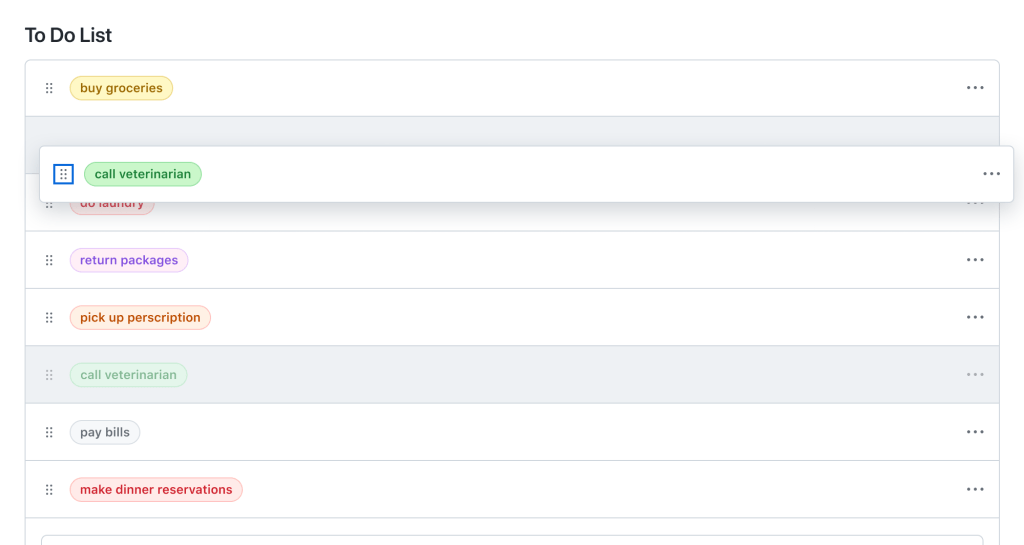
Drag-and-drop is a highly interactive and visual interface. We often use drag-and-drop to perform tasks like uploading files, reordering browser bookmarks, or even moving a card in solitaire.

Drag-and-drop is a highly interactive and visual interface. We often use drag-and-drop to perform tasks like uploading files, reordering browser bookmarks, or even moving a card in solitaire. It can be hard to imagine completing most of these tasks without a mouse and even harder without using a screen or visual aid. This is why the Accessibility team at GitHub considers drag-and-drop a “high-risk pattern,” often leading to accessibility barriers and a lack of effective solutions in the industry.
Recently, our team worked to develop a solution for a more accessible sortable list, which we refer to as ‘one-dimensional drag-and-drop.’ In our first step toward making drag-and-drop more accessible, we scoped our efforts to explore moving items along a single axis.

Based on our findings, here are some of the challenges we faced and how we solved them:
Challenge: Screen readers use arrow keys to navigate through content
One of the very first challenges we faced involved setting up an interaction model for moving an item through keyboard navigation. We chose to use arrow keys as we wanted keyboard operation to feel natural for a visual keyboard user. However, this choice posed a problem for users who relied on screen readers to navigate throughout a webpage.
To note: Arrow keys are commonly used by screen readers to help users navigate through content, like reading text or navigating between cells in a table. Consequently, when we tested drag-and-drop with screen reader users, the users were unable to use the arrow keys to move the item as intended. The arrow keys ignored drag-and-drop actions and performed typical screen reader navigation instead.
In order to override these key bindings we used role='application'.
Take note: I cannot talk about using role='application' without also providing a warning. role='application' should almost never be used. It is important to use role='application' sparingly and to scope it to the smallest possible element. The role='application' attribute alters how a screen reader operates, making it treat the element and its contents as a single application.
Considering the mentioned caution, we applied the role to the drag-and-drop trigger to restrict the scope of the DOM impacted by role='application'. Additionally, we exclusively added role='application' to the DOM when a user activates drag-and-drop. We remove role='application' when the user completes or cancels out of drag-and-drop. By employing role='application', we are able to override or reassign the screen reader’s arrow commands to correspond with our drag-and-drop commands.
Remember, even if implemented thoughtfully, it’s crucial to rely on feedback from daily screen reader users to ensure you have implemented role='application' correctly. Their feedback and experience should be the determining factor in assessing whether or not using role='application' is truly accessible and necessary.
Challenge: NVDA simulates mouse events when a user presses Enter or Space
Another challenge we faced was determining whether a mouse or keyboard event was triggered when an NVDA screen reader user activated drag-and-drop.
When a user uses a mouse to drag-and-drop items, the expectation is that releasing the mouse button (triggering an onMouseUp event) will finalize the drag-and-drop operation. Whereas, when operating drag-and-drop via the keyboard, Enter or Escape is used to finalize the drag-and-drop operation.
To note: When a user activates a button with the Enter or Space key while using NVDA, the screen reader simulates an onMouseDown and onMouseUp event rather than an onKeyDown event.
Because most NVDA users rely on keyboard operations to operate drag-and-drop instead of a mouse, we had to find a way to make sure our code ignored the onMouseUp event triggered by an NVDA Enter or Space key press.
We accomplished this by using two HTML elements to separate keyboard and mouse functionality:
1. A Primer Icon button to handle keyboard interactions.
2. An invisible overlay to capture mouse interactions.

Challenge: Announcing movements in rapid succession
Once we had our keyboard operations working, our next big obstacle was announcing movements to users, in particular announcing rapid movements of a selected item.
To prepare for external user testing we tested our announcements ourselves with screen readers. Because we are not native screen reader users, we moved items slowly throughout the page and the announcements sounded great. However, users typically move items rapidly to complete tasks quickly, so our screen reader testing did not reflect how users would actually interact with our feature.
To note: It was not until user testing that we discovered that when a user moved an item in rapid succession the aria-live announcements would lag or sometimes announce movements that were no longer relevant. This would disorient users, leading to confusion about the item’s current position.
To solve this problem, we added a small debounce to our move announcements. We tested various debounce speeds with users and landed on 100ms to ensure that we did not slow down a user’s ability to interact with drag-and-drop. Additionally, we used aria-live='assertive' to ensure that stale positional announcements are interrupted by the new positional announcement.
export const debounceAnnouncement = debounce((announcement: string) => {
  announce(announcement, {assertive: true})
}, 100)
Take note: aria-live='assertive' is reserved for time-sensitive or critical notifications. aria-live='assertive' interrupts any ongoing announcements the screen reader is making and can be disruptive for users. Use aria-live='assertive' sparingly and test with screen reader users to ensure your feature implores it correctly.
Challenge: First-time user experience of a new pattern
To note: During user testing we discovered that some of our users found it difficult to operate drag-and-drop with a keyboard. Oftentimes, drag-and-drop is not keyboard accessible or screen reader accessible. As a result, users with disabilities might not have had the opportunity to use drag-and-drop before, making the operations unfamiliar to them.
This problem was particularly challenging to solve because we wanted to make sure our instruction set was easy to find but not a constant distraction for users who frequently use the drag-and-drop functionality.
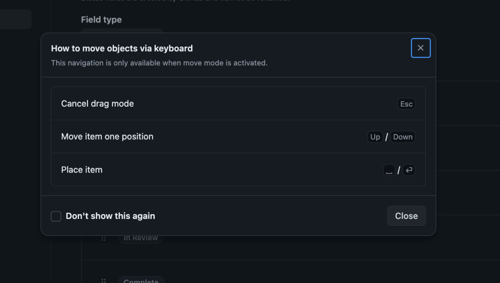
To address this, we added a dialog with a set of instructions that would open when a user activated drag-and-drop via the keyboard. This dialog has a “don’t show this again” checkbox preference for users who feel like they have a good grasp on the interaction and no longer want a reminder.

Challenge: Moving items with voice control in a scrollable container
One of the final big challenges we faced was operating drag-and-drop using voice control assistive technology. We found that using voice control to drag-and-drop items in a non-scrollable list was straightforward, but when the list became scrollable it was nearly impossible to move an item from the top of the list to the bottom.
To note: Voice control displays an overlay of numbers next to interactive items on the screen when requested. These numbers are references to items a user can interact with. For example, if a user says, “Click item 5” and item 5 is a button on a web page the assistive technology will then click the button. These number references dynamically update as the user scrolls through the webpage. Because references are updated as a user scrolls, scrolling the page while dragging an item via a numerical reference will cause the item to be dropped.
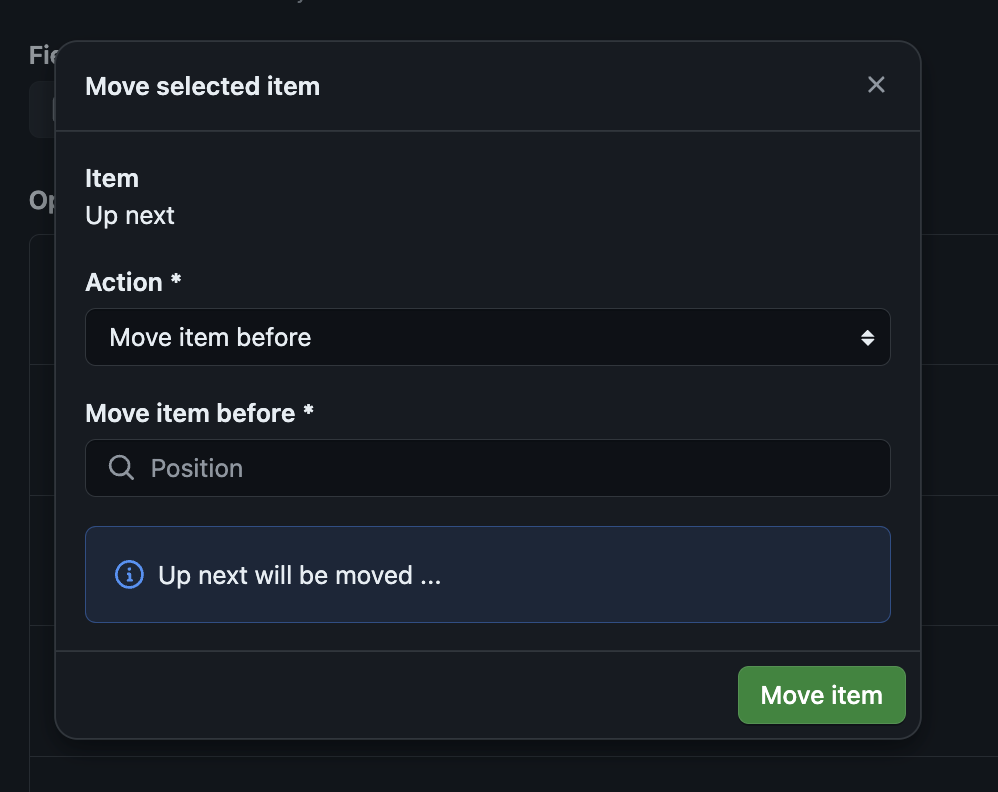
We found it critical to support two modes of operation in order to ensure that voice control users are able to sort items in a list. The first mode of operation, traditional drag-and-drop, has been discussed previously. The second mode is a move dialog.
The move dialog is a form that allows users to move items in a list without having to use traditional drag-and-drop:

The form includes two input fields: action and position.
The action field specifies the movement or direction of the operation, for example, “move item before” or “move item after.” And the position specifies the location of where the item should be moved.
Below the input fields we show a preview of where an item will be moved based on the input values. This preview is announced using aria-live and provides a way for users to preview their movements before finalizing them.
During our testing we found that the move dialog was the preferred mode of operation for several of our users who do not use voice control assistive technology. Our users felt more confident when using the move dialog to move items and we were delighted to find that our accessibility feature provided unexpected benefits to a wide range of users.
In Summary, creating an accessible drag-and-drop pattern is challenging and it is important to leverage feedback and consider a diverse range of user needs. If you are working to create an accessible drag-and-drop, we hope our journey helps you understand the nuances and pitfalls of this complex pattern.
A big thanks to my colleagues, Alexis Lucio, Matt Pence, Hussam Ghazzi, and Aarya BC, for their hard work in making drag-and-drop more accessible. Your dedication and expertise have been invaluable. I am excited about the progress we made and what we will achieve in the future!
Lastly, if you are interested in testing the future of drag-and-drop with us, consider joining our Customer Research Panel.
Tags:
Written by
Related posts

How GitHub uses eBPF to improve deployment safety
Learn how Github uses eBPF to detect and prevent circular dependencies in its deployment tooling.

The uphill climb of making diff lines performant
The path to better performance is often found in simplicity.

Continuous AI for accessibility: How GitHub transforms feedback into inclusion
AI automates triage for accessibility feedback, allowing us to focus on fixing barriers—turning a chaotic backlog into continuous, rapid resolutions.