A guide to designing and shipping AI developer tools
GitHub’s design experts share 10 tips and lessons for designing magical user experiences for AI applications and AI coding tools.

After three-plus years of concepting, designing, and shipping AI-driven developer tools, GitHub is continuing to explore new ways to bring powerful AI models into the developer workflow. Along the way, we’ve learned that the most important aspect of designing AI-driven products is to focus extensively on the developer experience (DevEx).
While it can now feel like there’s a new AI announcement from every company every week, we’re here to reflect on what it takes to build an AI product from scratch—not just to integrate an LLM into an existing product. In this article, we’ll share 10 tips for designing AI products and developer tools, and lessons we learned first-hand from designing, iterating, and extending GitHub Copilot.
Let’s jump in.
Tip 1: Build on the creative power of natural language
“The hottest new design system is natural language,” reports the team designing GitHub Copilot. According to them, the most important tools to develop right now are ones that will allow people to describe, in their respective natural languages, what they want to create, and then get the output that they want.
Leveraging the creative power of natural language in AI coding tools will shift the way developers write code and solve complex problems, fueling creativity and democratizing software development.
Idan Gazit, Senior Director of Research for GitHub Next, identifies new modalities of interaction, or patterns in the way code is expressed to and written by developers. One of those is iteration, which is most often seen in chat functionalities. Developers can ask the model for an answer, and if it isn’t quite right, refine the suggestions through experimentation.
He says, “When it comes to building AI applications today, the place to really distinguish the quality of one tool from another is through the tool’s DevEx.”
To show how GitHub Copilot can help developers build more efficiently, here’s an example of a developer learning how to prompt the AI pair programmer to generate her desired result.
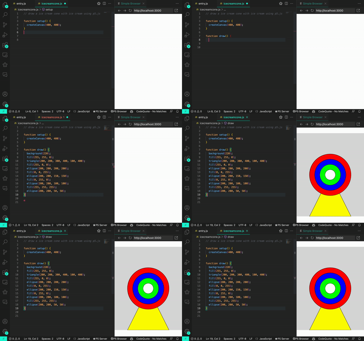
A vague prompt like, “Draw an ice cream cone with ice cream using p5.js,” resulted in an image that looked like a bulls-eye target sitting on top of a stand:

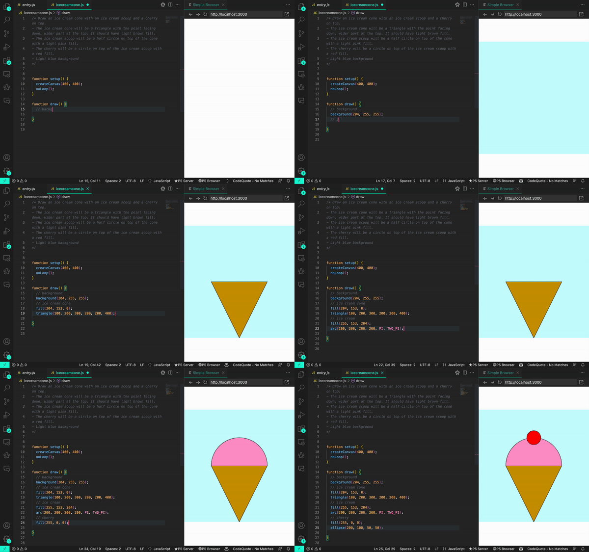
A revised prompt that specified details about the desired image, like “The ice cream cone will be a triangle with the point facing down, wider point at the top,” helped the developer to generate her intended result, and saved her from writing code from scratch:

| What does it take to design products with AI? Learn more from Gazit about patterns and practices for making AI-powered products. |
Tip 2: Identify and define a developer’s pain points
Designing for developers means placing their needs, preferences, and workflows at the forefront. Adrián Mato, who leads GitHub Copilot’s design team, explains, “It’s hard to design a good product if you don’t have an opinion. That’s why you need to ask questions, embrace user feedback, and do the research to fully understand the problem space you’re working in, and how developers think and operate.”
Keeping devs in the flow
For example, when designing GitHub Copilot, our designers had to make decisions about optionality, which is when an AI model provides a developer with various code completion suggestions (like GitHub Copilot does through ghost text) that the developer can review, accept, or reject. These decisions are important because writing software is like building a house of cards—tiny distractions can shatter a developer’s flow and productivity, so designers have to make sure the UX for coding suggestions makes a developer’s job easier and not the other way around.

Considering ghost text and going modeless
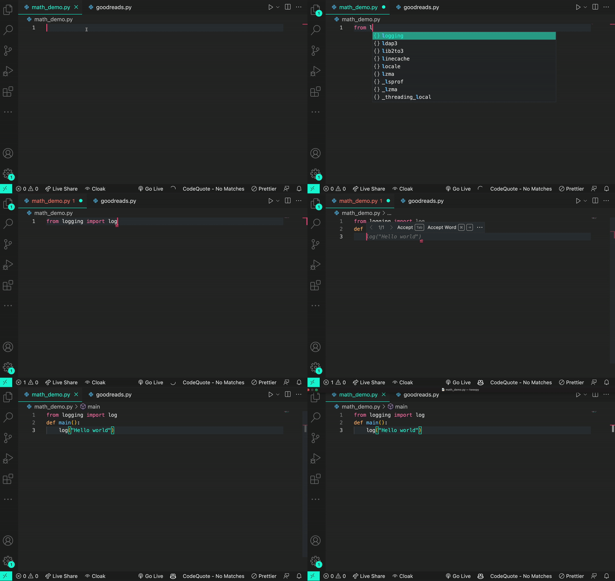
When GitHub Copilot launched as a technical preview in June 2021 and became generally available in June 2022, ghost text—the gray text that flashes a coding suggestion while you type—was lauded as keeping developers in the flow because it made the code completion suggestions easy to use or ignore. In other words, the AI capability is modeless: Users don’t have to navigate away from the IDE to use it, and the AI works in the background.
GitHub Copilot also suggests code in a way that allows the user to continuously type: either press tab to accept a suggestion or keep typing to ignore the suggestion. “Modeless AI is like riding an electric bike with a pedal assist rather than one where you have to switch gears on the handlebar,” Gazit explains.
When it comes to addressing developer pain points, this pedal assist is essential to keeping them in the flow and doing their best work.
Tip 3: Gather meaningful developer feedback
Knowing how to ask for the right kind of feedback is critical to designing a useful product. To keep bias from creeping into each part of the research process, Grace Vorreuter, Principal Researcher for GitHub’s Communities team, shares unbiased interview questions to get you started on the right path:
- What’s the hardest part about [x situation] today? This question helps to contextualize the problem.
- Can you tell me a story about the last time that happened? Stories allow researchers to dive deeper into user problems, learn context, empathize with customers, and remember what information they shared.
- Can you say more about why that was difficult? This question uncovers a deeper layer of the problem.
- What, if anything, have you tried to solve that problem? If the user shares they’ve already looked for a solution, it’s a signal that this is a significant problem.
- What’s not ideal about your current solution? This question can reveal an opportunity space.
- How often do you experience this problem? This gives a sense of the size of the problem.
Tip 4: Design for imperfection
Rosenkilde’s justification of the double trigger in the technical preview of GitHub Copilot CLI reinforces an important fact: LLMs can be wrong. While no tool is perfect, the ability of LLMs to hallucinate, or convincingly spit out false information, is important to keep in mind.
Though models will improve in the future—and we’ll discover better prompting strategies that generate reliable responses—we don’t have to wait until tomorrow to build. We can innovate responsibly today by designing around the capabilities of current models.
“We have to design apps not only for models whose outputs need evaluation by humans, but also for humans who are learning how to interact with AI,” Gazit says. “Ghost text is one of the first mechanisms that make evaluation cheap and seamless, in that wrong suggestions are ignorable. We have to design more user experiences that are forgiving of today’s imperfect models.”
A well-designed tool helps to establish a foundation of trust. “But it doesn’t compensate for leading someone awry, which can happen with generative AI,” adds Manuel Muñoz Solera, Senior Director of Product Design at GitHub. Developers expect an AI model to pull in all the right context to answer a query, every single time, but there’s a technical boundary in that today’s LLMs process a limited amount of context. That poses a tough but interesting challenge when designing the UX, which needs to manage a user’s expectations while still providing a solution.
Tip 5: Recognize bias in your research
Vorreuter also shares pointers for recognizing different kinds of bias that surface during user research:
- Confirmation bias is when data is analyzed and interpreted to confirm hypotheses and expectations. To avoid this bias in research, try to invalidate your hypothesis, and report on all findings (positive and negative) to avoid cherry-picking results.
For example, let’s say your hypothesis is that AI coding tools make developers more collaborative. A question like “Do you agree or disagree that AI coding tools make you more collaborative?” assumes part of your hypothesis—that all developers use AI coding tools—is true. The question also forces a yes or no response. On the other hand, a question like “In what ways do you imagine a world with AI coding tools will impact collaboration within teams?” encourages a nuanced response.
-
Leading language is when a question or task uses certain wording that provides a hint for a particular response or behavior the interviewer is looking for (like “How much does waiting for CI pipelines to run negatively impact your day?”). To avoid this trap, prepare a discussion guide that includes open-ended, non-leading questions (such as “Which of the following do you spend the most time doing on any given day?” followed by a list of options to rank in order). Then, ask for peer feedback on your discussion guide and hold a pilot interview, after which you can iterate on your questions.
-
Selection bias is when study participants haven’t been selected at random, so certain kinds of people, more than others, are included in the study and skew the results. To avoid this bias, refer to your study’s objectives when deciding what kind of customers to solicit. Be proactive and actively seek out the folks you’re looking for rather than letting people self-select into giving feedback.
This list isn’t exhaustive, nor are all the solutions fool proof—but at GitHub, we’ve found these three tips to be incredibly helpful reminders about how bias can cloud our approach to product design.
Tip 6: Allow developers to customize context views
Developers need easy access to a lot of different information when writing code—or, said another way, context is key for developers. A common design question is how much information and context should be displayed on the UI, and how to design a UX that makes context switching feel seamless. We found that when developers are given options to tailor a product to their preferences and requirements, their DevEx becomes personalized and comfortable.
According to Nicolas Solerieu, Senior Site Designer at GitHub, minimizing the amount of visual variation and elements to scan can create a feeling of immersion even when the developer has to context switch. But sometimes developers need rapid data consumption to find the necessary information.
Developer tools should allow users to view information at different scales, from a general view that makes an entire workflow visible to a granular one that highlights an individual problem.
Tip 7: Design for extensibility
Sometimes it’s the ability to amplify the capabilities of an existing tool—instead of building a new one—that improves a developer’s workflow. Because developers typically use a large number of tools, offering smooth integrations pays dividends for the developer experience.
Well-written documentation and APIs, for example, are critical to a developer’s understanding, set up, and extensibility of a tool. When tools are built with extensibility and integration in mind, they can be optimized for a developer’s custom needs, and, ultimately, enable efficient application builds and deployment.
|
Check out our guides to improve your documentation and APIs:
|
Tip 8: Design for accessibility
A good reminder when designing accessible tooling is that designs for users with disabilities also benefit users without disabilities in extraordinary circumstances. For example, designing a system for those with visual impairments can also help someone struggling to read an e-reader in bright sunlight. Rachel Cohen, Director of Design Infrastructure at GitHub, encourages designers to embrace a “shift-left” mindset and consider the requirements of individuals with disabilities earlier in the design process. The result is more resilient, inclusive, and forward-thinking solutions.
Want to advance your organization’s accessibility practices? Apply these tactics and lessons from GitHub’s Design team.
Tip 9: Prioritize performance over flashy features
Striking a balance between adding new features and optimizing existing ones can be challenging, but the priority should always be to maintain or improve the tool’s performance.
“Developer tooling is very specific in that the available technology is applied to solve an identified problem in the best way possible,” according to Muñoz Solera. “The technology is used with purpose and isn’t just used to drive product engagement.”
|
GitHub Copilot X is our envisioned future of AI-powered software development. Discover what’s new. |
Tip 10: Use a tool’s safeguards to upskill developers and improve AI models
AI applications should have a revision workflow that allows developers to revise an output from the AI model. This is the workflow we built into GitHub Copilot’s ghost text UX and GitHub Copilot Chat.
In GitHub Copilot for CLI, explanations comprise the revision workflow. Rosenkilde says that a revision workflow not only helps to mitigate risk, but also helps to educate the developer: “The suggested command might be an arcane shell script, so maybe the developer doesn’t understand what that command will do once it runs. The explanation is there to help guide the developer through the shell command’s function and verify it against the original problem the developer is trying to solve.”
A revision workflow is also a way for a developer to send feedback to the AI model. Feedback mechanisms built into UIs include the acceptance or ignore rate of AI-generated coding suggestions, the option for users to regenerate a response, and the ability for users to recover when a model falters. “We’re still in an experimental phase with generative AI,” Muñoz Solera says, “so we need to design AI tools that make it easy for developers to signal when the quality of the model’s output isn’t there.”
The path forward
Designers, engineers, and users of AI tools are starting to move beyond the shock value of generative AI models: They’re moving toward understanding the technology and, consequently, becoming more discerning about its use cases.
Here’s what we learned after three years of conceptualizing, designing, and extending AI-powered developer tools, like GitHub Copilot and GitHub Copilot Chat: There’s a lot more to discover.
We hope that sharing these tips will help to accelerate collective learning during this new age of software development.
From the outside, innovation looks like making giant leaps of progress. But innovation from the inside is repetition and making small steps forward.
Learn more about generative AI coding tools and LLMS
- What developers need to know about generative AI
- How generative AI is changing the way developers work
- How GitHub Copilot is getting better at understanding your code
- Working with the LLMs behind GitHub Copilot
Tags:
Written by
Related posts

Building AI-powered GitHub issue triage with the Copilot SDK
Learn how to integrate the Copilot SDK into a React Native app to generate AI-powered issue summaries, with production patterns for graceful degradation and caching.

How Squad runs coordinated AI agents inside your repository
An inside look at repository-native orchestration with GitHub Copilot and the design patterns behind multi-agent workflows that stay inspectable, predictable, and collaborative.

Continuous AI for accessibility: How GitHub transforms feedback into inclusion
AI automates triage for accessibility feedback, allowing us to focus on fixing barriers—turning a chaotic backlog into continuous, rapid resolutions.
