Building a more inclusive GitHub Global Campus
Every student and teacher deserves the same access to GitHub Education offerings. We’ve enlisted GitHub’s Accessibility team to help identify areas for improving inclusivity.

GitHub is the home for all developers, a place where we come together to learn, collaborate, and ship code. At GitHub Education, our goal is to welcome students and teachers into that home and provide them with the skills and leading industry tools to complete their academic journey, from classroom engagement to career readiness. We believe every student and teacher deserves the same access to our offerings.
GitHub Education recently took a close look at GitHub Global Campus, the portal that showcases all of GitHub Education’s tools, programs, and resources in one place. We enlisted the help of GitHub’s Accessibility team to audit the pages and features of GitHub Global Campus against accessibility standards, such as the Web Content Accessibility Guidelines (WCAG), and point out areas of the application that could be made more inclusive.
Gathering and implementing feedback
The GitHub Accessibility team includes testers with lived experience in using assistive technologies. GitHub Education has spent the past several months taking in their feedback, working with designers, and improving the code to remove barriers that may block access. We’ve updated features, tested, and iterated until we’ve landed on the best and most inclusive solutions.
Shipping fixes
Many of the changes you’ll find on GitHub Global Campus include improving the way we write HTML:
- Reviewing headings so that the content hierarchy makes sense and so that any user can skim or skip to the information they want.
- Making sure the linkable things are links and the clickable things are buttons.
- Including more semantic tags to make the pages easier to navigate and interact with.
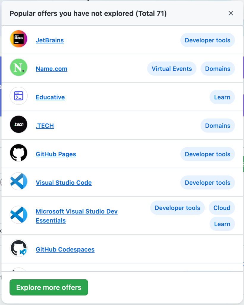
The code also now uses more components from Primer, GitHub’s open source design system. This gives GitHub Global Campus the accessibility features that are built into the rest of GitHub, in addition to better matching the GitHub experience that you’re used to. Check out modal windows on GitHub Global Campus, for example, if you’re using a keyboard, they now hold focus, land on the close button, and return you to where you left off on the page when you exit out of them. If you’re exploring GitHub Global Campus visually you may not notice all of the changes, but we hope these are big improvements for many other users.

What’s next
The GitHub Education team is joining the effort to build a more accessible GitHub, and we’re only just getting started. Going forward, linters will automate accessibility checks and prevent regressions, but our engineering team will also continue working with the GitHub Accessibility team to find the improvements that we can only find manually. Our learnings from the current process will be applied throughout all GitHub Education products to provide a more inclusive platform in the future.
Get involved
Learn more about our efforts to build a more inclusive GitHub at accessibility.github.com, and share your feedback in the Accessibility Feedback category on GitHub Discussions.
Want to contribute to one of the open source projects that has a direct impact on our product? Check out our documentation and the Primer Design System.
Tags:
Written by
Related posts

GitHub for Beginners: Getting started with GitHub security
Learn how to secure your projects and keep them safe with GitHub Advanced Security.

Building AI-powered GitHub issue triage with the Copilot SDK
Learn how to integrate the Copilot SDK into a React Native app to generate AI-powered issue summaries, with production patterns for graceful degradation and caching.

GitHub for Beginners: Getting started with GitHub Actions
Set up your first GitHub Actions workflow in this how-to guide.