Retiring Impact Graphs
Back in April, we launched some amazing new graphs. One of the new visualizations we’ve found especially useful is the contributors page. We’re constantly looking at it to get a…
Back in April, we launched some amazing new graphs.
One of the new visualizations we’ve found especially useful is the
contributors page.
We’re constantly looking at it to get a sense of activity on our projects. It’s
a great way to see who’s contributing and how much of an impact they’re having
relative to other members of a project. The contributors page today is a much
better impact graph than the impact graph ever was.
So today, after four years in service, we’re retiring the impact graph.
Contributors to github
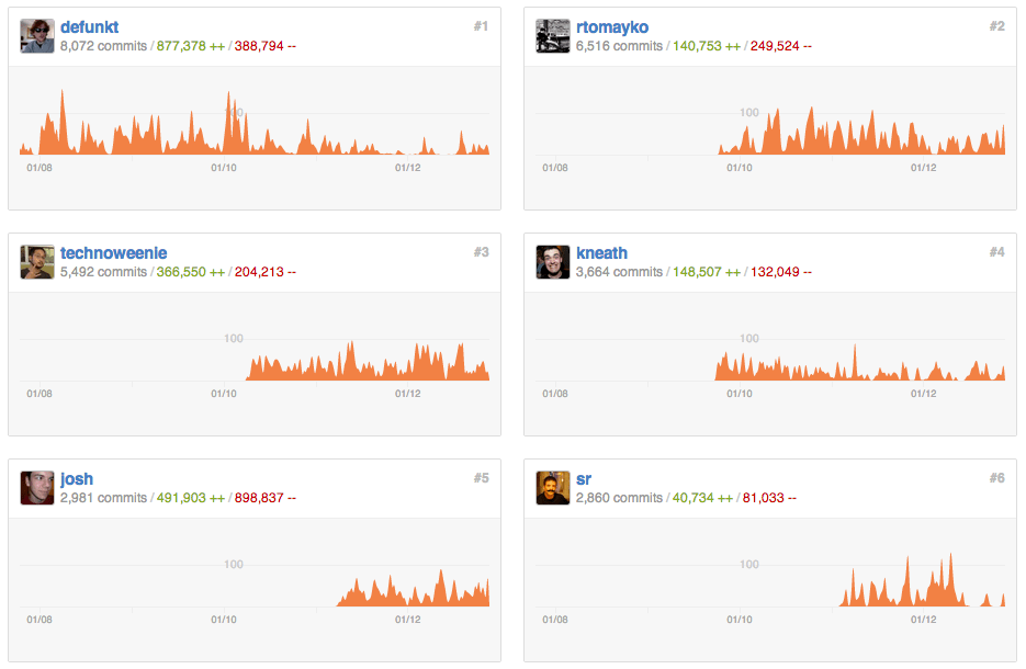
Check out the contributions page of a few of our favorite repositories:
Written by

Related posts

GitHub availability report: February 2026
In February, we experienced six incidents that resulted in degraded performance across GitHub services.

Addressing GitHub’s recent availability issues
GitHub recently experienced several availability incidents. We understand the impact these outages have on our customers and are sharing details on the stabilization work we’re prioritizing right now.

GitHub availability report: January 2026
In January, we experienced two incidents that resulted in degraded performance across GitHub services.