How we keep GitHub fast
The most important factor in web application design is responsiveness. And the first step toward responsiveness is speed. But speed within a web application is complicated. Our strategy for keeping…
The most important factor in web application design is responsiveness. And the first step toward responsiveness is speed. But speed within a web application is complicated.
Our strategy for keeping GitHub fast begins with powerful internal tools that expose and explain performance metrics. With this data, we can more easily understand a complex production environment and remove bottlenecks to keep GitHub fast and responsive.
Performance dashboard
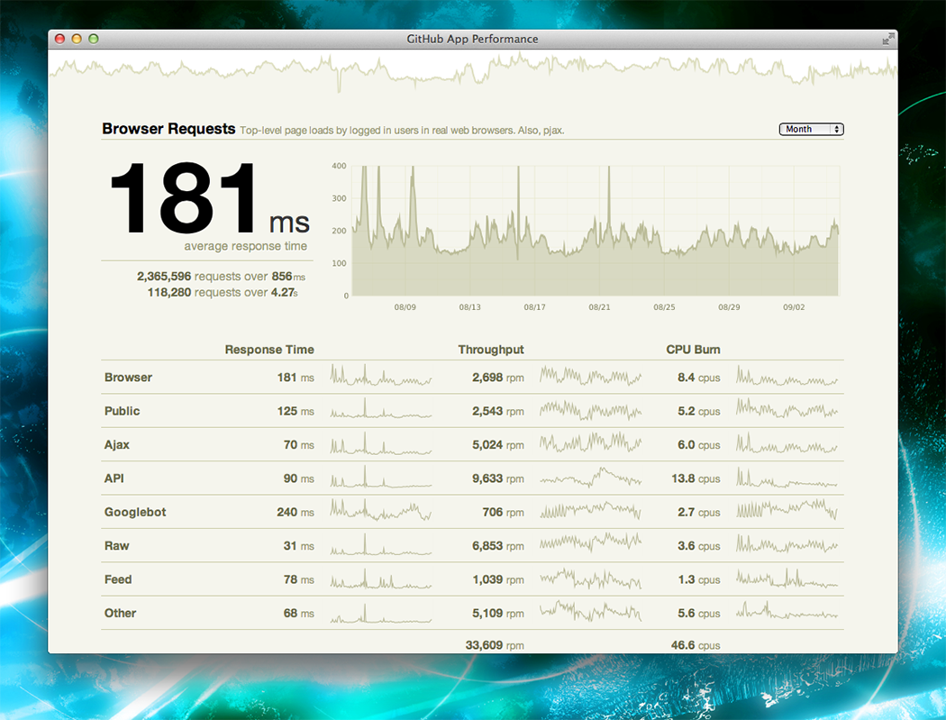
Response time as a simple average isn’t very useful in a complex application. But what number is useful? The performance dashboard attempts to give an answer to this question. Powered by data from Graphite, it displays an overview of response times throughout github.com.

We split response times by the kind of request we’re serving. For the ambiguous items:
- Browser – A page loaded in a browser by a logged in user.
- Public – A page loaded in a browser by a logged out user.
Clicking one of the rows allows you to dive in and see the mean, 98th percentile, and 99.9th percentile response times.
The performance dashboard shows performance information, but it doesn’t explain. We needed something more fine-grained and detailed.
Mission control bar
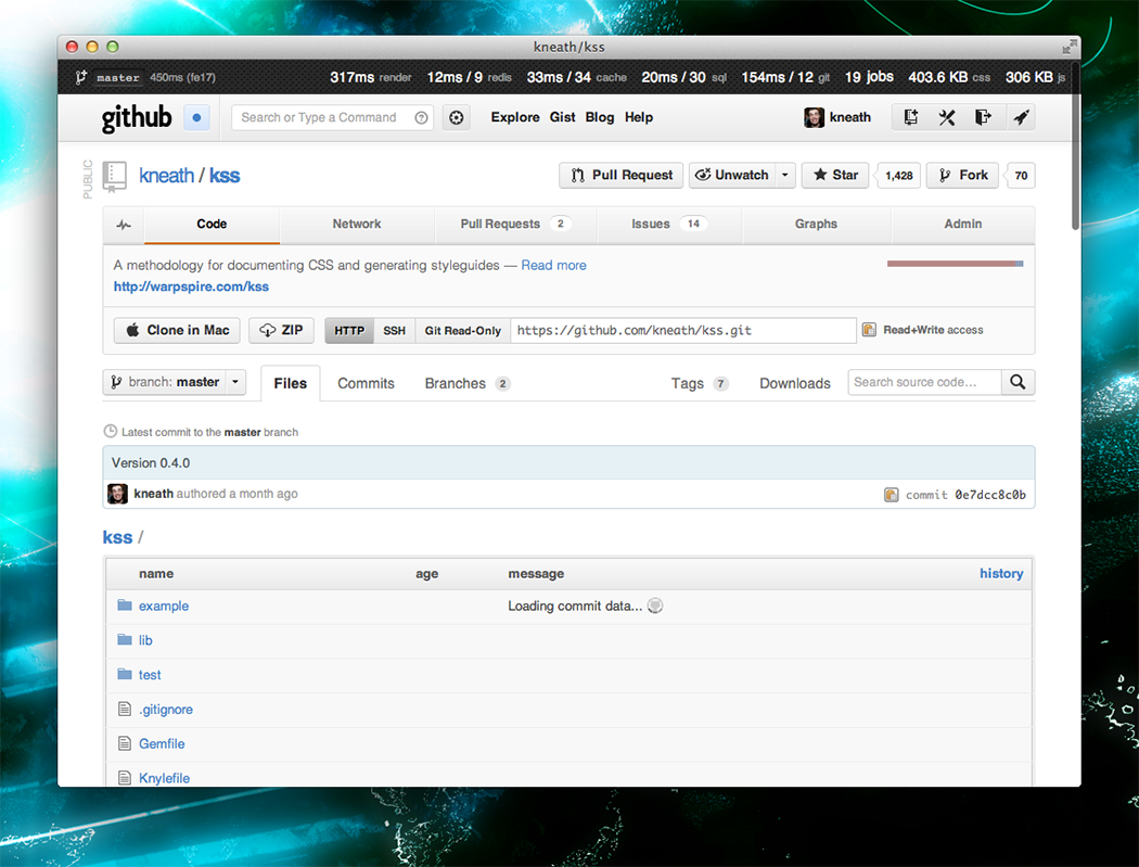
GitHub staff can browse the site in staff mode. This mode is activated via a keyboard shortcut and provides access to staff-only features, including our Mission control bar. When it’s showing, we see staff-only features and have the ability to moderate the site. When it’s hidden, we’re just regular users.
Spoiler alert: you might notice a few things in this screenshot that haven’t fully shipped yet.

The left-hand side shows which branch is currently deployed and the total time it took to serve and render the page. For some browsers (like Chrome), we show a detailed breakdown of the various time periods that make up a rendered page. This is massively useful in understanding where slowness comes from: the network, the browser, or the application.

The right-hand side is a collection of various application metrics for the given page. We show the current compressed javascript & css size, background job queue, and various data source times. For the ambiguous items:
- render – How long did it take to render this page on the server?
- cache – memcached calls.
- sql – MySQL calls.
- git – Grit calls.
- jobs – The current background job queue.
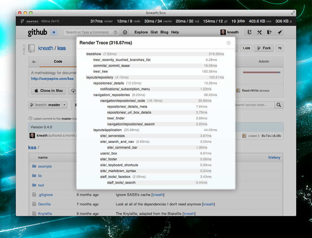
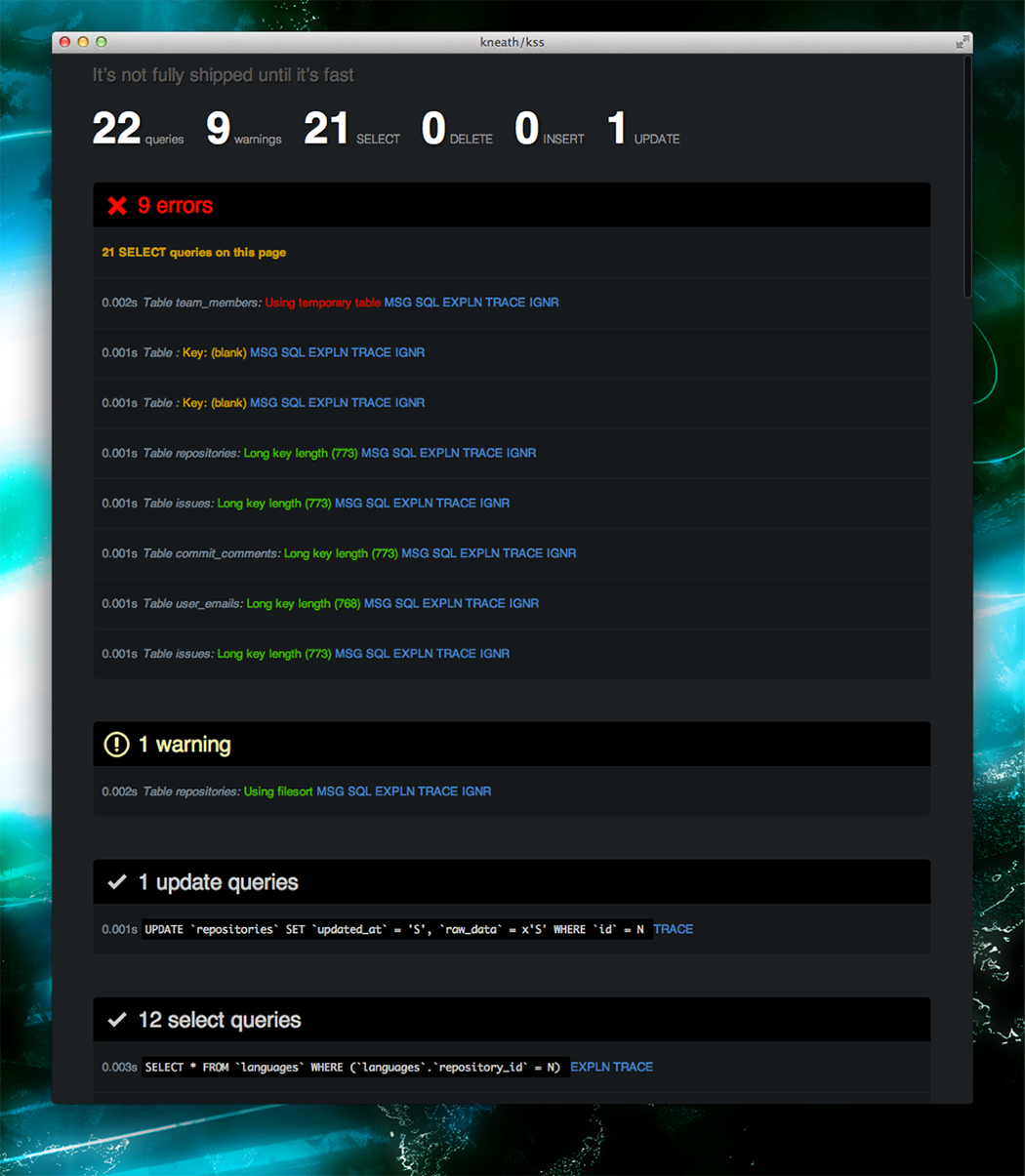
When we’re ready to make a page fast we can dive into some of these numbers by clicking on them. We’ve hijacked many features from rack-bug and query-reviewer to produce these breakdowns.


And many more…
It goes without saying that we use many other tools like New Relic, Graphite, and plain old UNIX-foo to aid in our performance investigations as well.
A lot of the numbers in this post are much slower than I’d like them to be, but we’re hoping with better transparency we’ll be able to deliver the fastest web application that’s ever existed.
As @tnm says: it’s not fully shipped until it’s fast.
Written by
Related posts

GitHub availability report: March 2026
In March, we experienced four incidents that resulted in degraded performance across GitHub services.

GitHub Universe is back: We want you to take the stage
Get inspired by five of the most memorable, magical, and quirky Universe sessions to date.

What’s coming to our GitHub Actions 2026 security roadmap
A look at GitHub Actions’ 2026 roadmap, outlining how secure defaults, policy controls, and CI/CD observability harden the software supply chain end to end.