Designing GitHub for Windows
This article hasn’t been updated in a while. For the most current information, please refer to the docs and the Desktop website. Today, I thought it would be fun to…
This article hasn’t been updated in a while. For the most current information, please refer to the docs and the Desktop website.
Today, I thought it would be fun to give some insight into how we do
native application design at GitHub. Many people are surprised to hear
the breadth of design and code that happens at GitHub on a daily basis.
We love Ruby and Rails, but we are far from a single language dev shop.
We write code in Ruby, Python, JavaScript, CoffeeScript, Objective-C,
C#, C, C++, Java, and shell of various flavors from Bash to PowerShell.
On the design side of things we obviously build web and native
applications, but we also do print,
animation and motion graphics. We design
booths, stamps, whisky glasses,
dodgeball uniforms, business cards and many
many octocats. Most of our designers work in Adobe products
but we did branch out a bit as a part of creating GitHub for Windows.
Even though we shipped GitHub for Mac almost a year before
GitHub for Windows, we’ve known for a long time that we wanted
to build platform-specific native applications. In fact, both
applications were conceived at the same time and share some core design
principals. They also share a lot of low level code in the form of
libgit2, but by and large they are entirely separate
entities. We specifically made the decision to write each application in
a language native to the platform, and this has turned out to be hugely
beneficial to us. Because of this separation we’ve been free to tackle
the problems that are most pressing for each platform and work in the
best possible tools instead of being constrained to the lowest common
denominator.
So how does an application like GitHub for Windows get built from a
design standpoint? It all starts with an idea and convincing someone
else to work on it.
Metro
In the end, Metro was my secret weapon in convincing Cameron
McEfee to work on this project with
me. Cameron was coming from a design background in print media and the
layout and typography of Metro really caught his eye. The rigid grid
system and Swiss design principals, along with a very modern and clean
feel made the prospect of designing a native GitHub client in this style
very exciting. After sharing a few sketches and some initial prototyping
work I had done, Cameron was hooked and the application started to take
shape.
Concept
Despite the existence of incredible mocking tools, I still like to start
my design work with a pencil and my notebook. Paper is still a very
powerful medium for concept work.
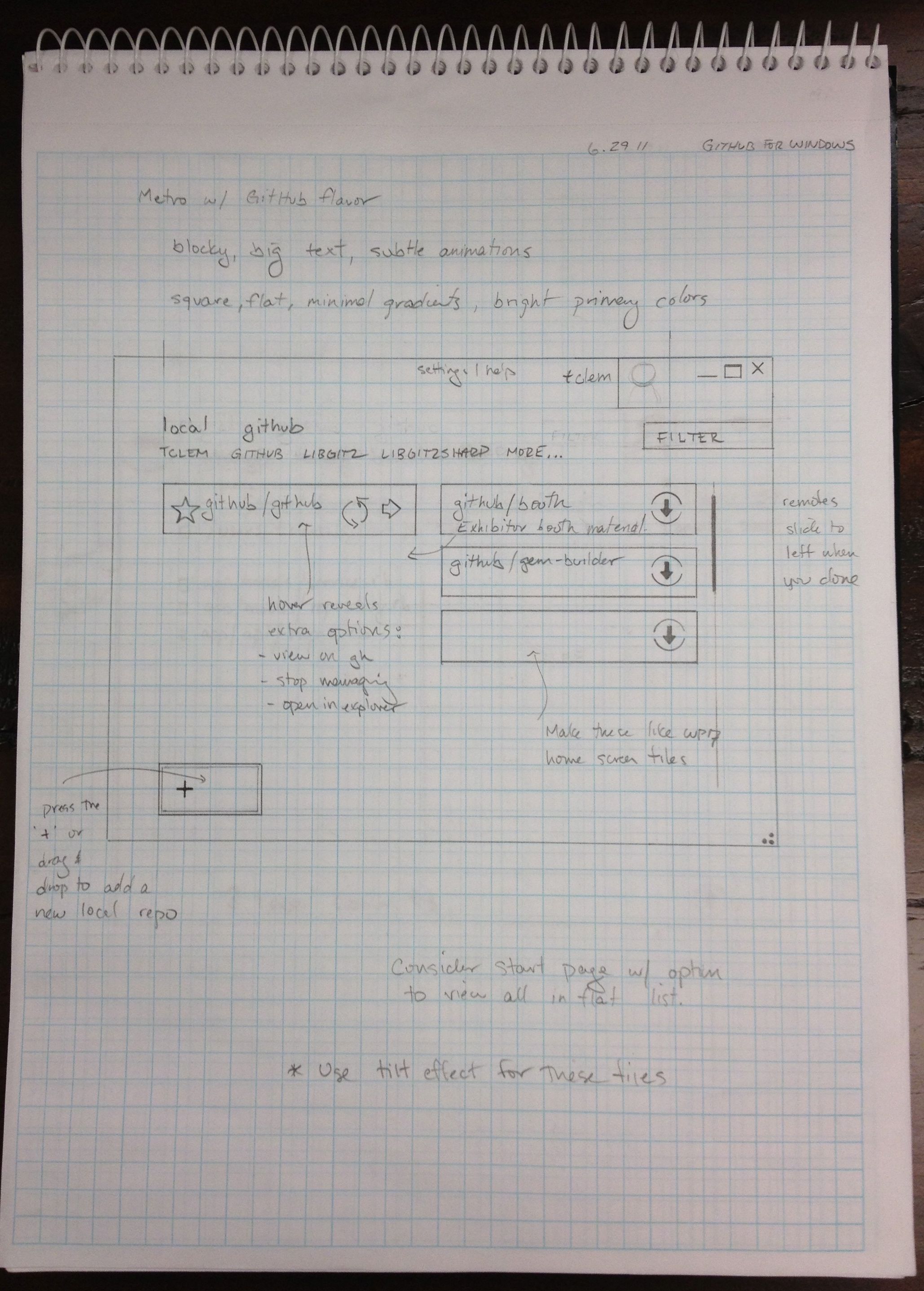
This is my original sketch of the dashboard in GitHub for Windows. You
can see one of my first XAML mocks kept some similar ideas.
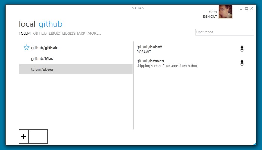
Here is one of Cameron’s first takes:
At this point, we were still discovering what is useful to display on
this view and trying to understand how this would actually be
implemented in WPF. At GitHub, we work in a very fast, iterative design
process. In this particular case, Cameron and I would trade mocks and do
design reviews dozens of times a day. We try to get design work out as
early as possible for peer review and iteration. It can initially be
intimidating to get feedback on incomplete work, but once you learn to
take things in stride it’s hard to imagine working any other way.
A key part of this iterative cycle is that a single person generally
owns the design. We don’t create A, B, C versions and present them
to the CEO. We don’t have dedicated product managers (or managers of any
sort). Instead, we do work in small self-forming teams and those teams
generally end up naturally surfacing someone who owns the design.
The result is consistent, but opinionated design.
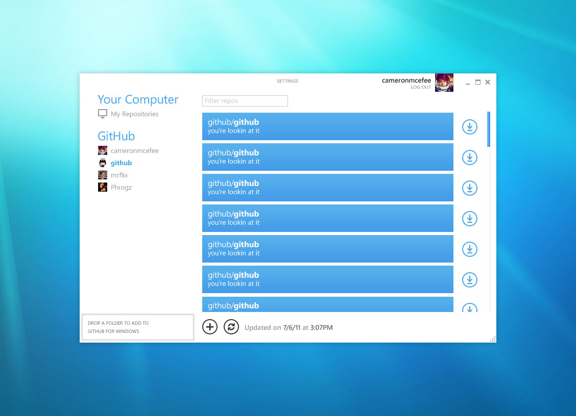
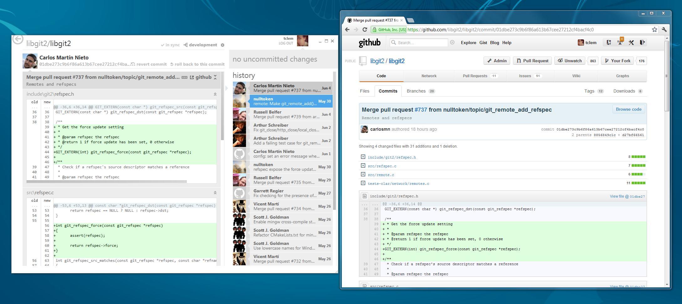
Just for reference, here is how the dashboard ended up in the final
release. We slowly refined our idea of Metro and began to add in more
GitHub elements while actually moving away from how applications like
Zune interpret Metro.
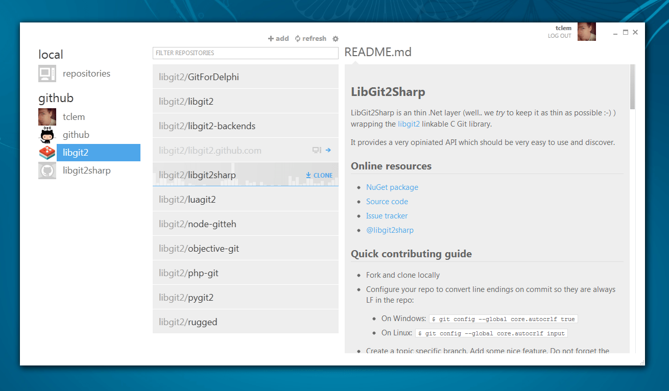
In the end you can see that the design is clean – living on the strict
Metro grid system and definitely focusing on content over chrome.
However, we have very specifically made this native app have some of the
feel of GitHub.com. A side-by-side perspective of the app and the
website provides an interesting example of the affinity.
XAML
One of the wonderful things about WPF applications is that you can
basically build anything that you can create in a Photoshop or
Illustrator mock-up. Cameron tended to work largely in Photoshop and I
would come in to tweak things and then re-create them in XAML (with
little or no underlying functionality). We would keep doing design as new
visual elements of the application came up. So, for instance, we didn’t
actually design a progress bar until I had need of one in the
application.
As we got further along, I started committing completely to
XAML and used the Photoshop mocks merely as reference points. I tend to
work half in Blend and half in Visual Studio. If you’ve never used one
of the XAML designers before I have to tell you that one of my favorite
things is how you can write markup and watch the design change, or use
the color palette and watch the markup change. It is like changing HTML
and CSS on the fly in the Chrome inspector except you are actually
editing the real code and various other assets in a full fidelity editor.
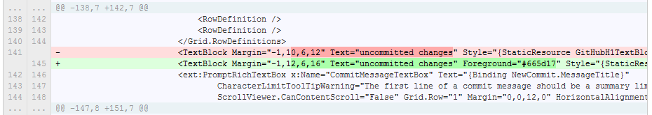
Practically, this means that you can really quickly tweak colors, alignment, and even basic
components of a control without a large debug or refresh cycle. And in
the end, you check in a version-able document to your repository so that
when I change the foreground color of a text field, it is an obvious diff
on GitHub.com. Try doing that with a Photoshop document!
Styling and Templating
The other amazing thing about doing design in XAML is that you have
control over not just how your controls are styled, but also the basic
graphic components of a control. Standard buttons in WPF look like this:
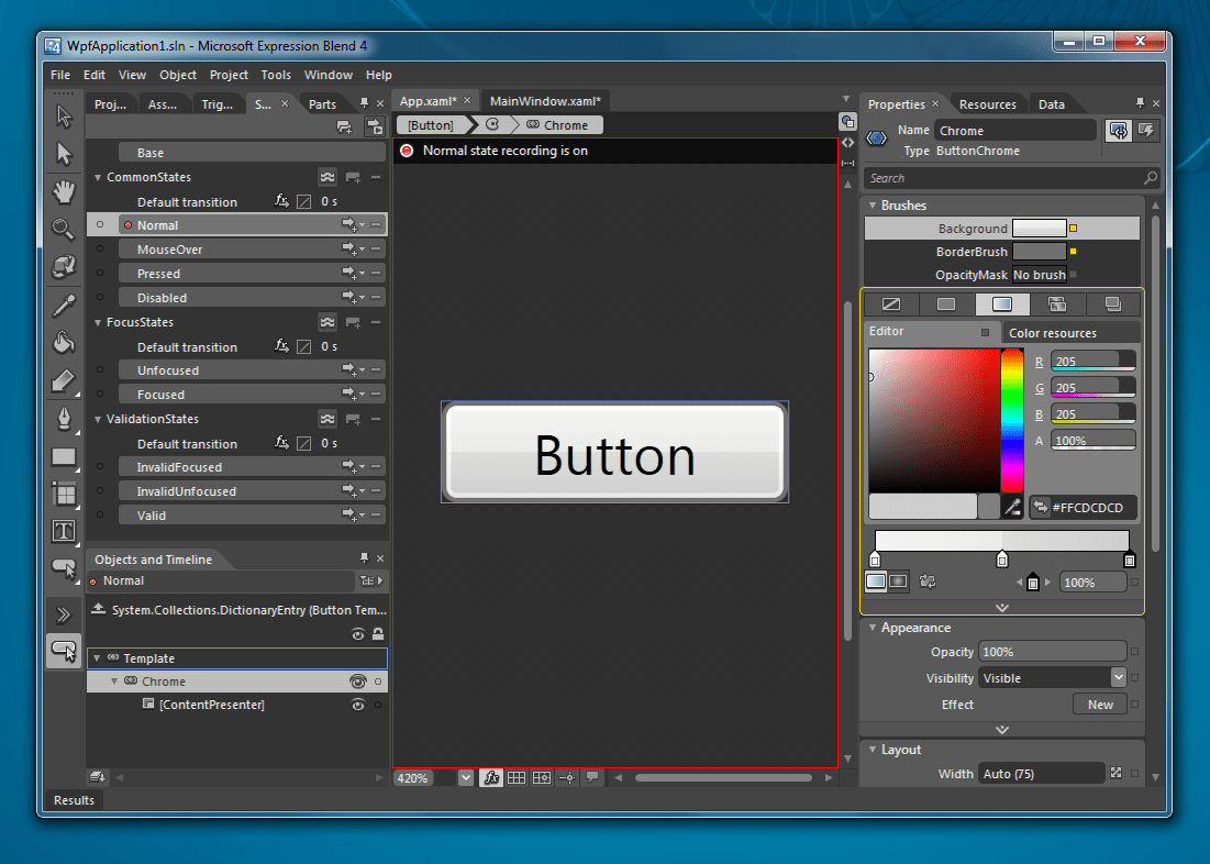
But we redefined what a button looks like entirely. This can be done in
a way where buttons have to opt into the style/template, but it can also
be done in a way where you override every button. This is subtly
powerful. Here is how we define one of our buttons:
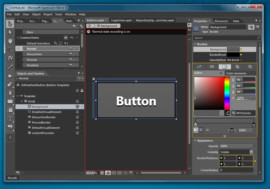
Along with doing basic graphic design, Blend also lets you do
interaction design. In Photoshop, you might have to manually lay out a
series of buttons that represent what a button looks like in the various
states of hover, pressed, normal, disabled, focused, etc. In XAML
this is natively supported through something called the VisualStateManager,
and from a design-time perspective you actually get to ‘record’ what
each of those states look like and then play with the behavior of the
object. You can even control how the movement between states happens by
animating properties as part of state transition.
Borderless Window
One of the most striking parts of GitHub for Windows is that it ditches
the traditional Windows chrome almost entirely. We have a small control
box for the traditional min/max/close buttons, but otherwise we killed
all the rest of the chrome. Here is how we did that.
Our borderless Window is implemented as a behavior that can be attached
to any Window in XAML like so:
<Window xmlns:win="clr-namespace:GitHub.Extensions.Windows"
        xmlns:i="http://schemas.microsoft.com/expression/2010/interactivity">
    <i:Interaction.Behaviors>
        <win:BorderlessWindowBehavior />
    </i:Interaction.Behaviors>
  ...
</Window>
The min/restore/close buttons are just custom XAML buttons where we’ve
written the appropriate code to make them behave as you would expect.
The meat of the BorderlessWindowsBehavior happens in the callback where
we handle a few specific window messages to control the display of the
window. We got a lot of help and inspiration from MahApps which has a
similar BorderlessWindowBehavior.
I don’t know if killing the chrome is going to be widely adopted on
Windows, but I hope that it is. For me, those 5px borders and
the massive title area on each window are simply artifacts of a past
life. They are distracting, largely unnecessary, and take up space
without providing functionality. Plus, even the standard window chrome
on to-be-released Windows 8 makes it look like your computer is 20 years
old.
This doesn’t necessarily mean that every application should or needs to
be a metro application, but it has been fun to see even Visual Studio
move towards this style. I think this is very welcome change.
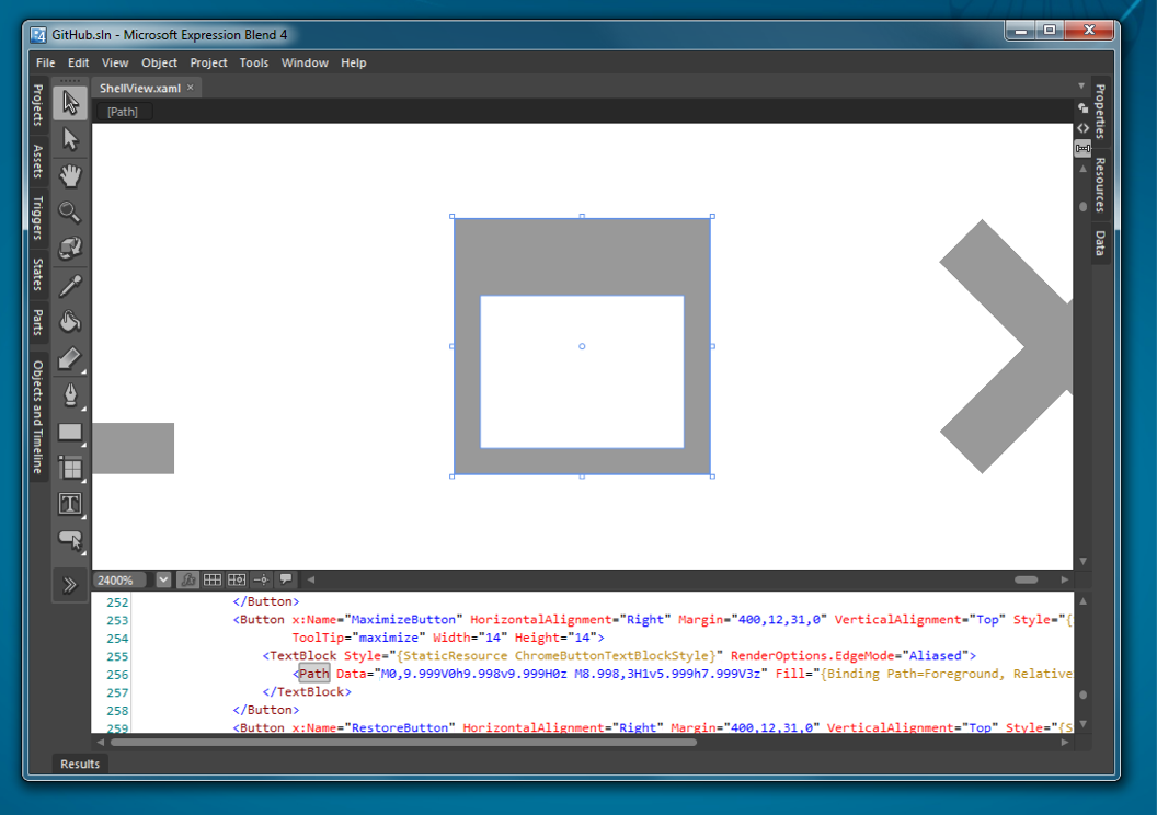
Vectors
We leverage vector graphics as much as possible in GitHub for Windows.
This makes the application resolution independent and makes it really
easy to move designs from Photoshop/Illustrator to WPF. For
instance, the maximize button is implemented with this path:
Performance
There was a lot of criticism in the early days of WPF about performance
and some of it was warranted in the initial versions of the framework.
These days, the tools are at your disposal to make great WPF
applications. The only major thing we’ve noticed is if you are running
old hardware and old operating systems (ahem, XP, I’m looking at you),
then WPF has to fall back to software rendering and this tends to be a
bit more memory and processor intensive. To the credit of the framework
we were able to release a single application that supports a huge
range of operating systems from a single code base with almost zero
platform specific code.
Some notes about performance. XAML files (an XML format) are actually
compiled down to a binary format (BAML) which makes them wicked fast to
load at runtime (sort of how nibs/xibs work on Mac/iOS). What’s most important
to GUI applications is perceived performance and a responsive UI, which we achieve using Rx and making sure that we don’t perform blocking operations on the UI thread.
This is the same kind of thing you have to watch out for
when writing a node application, for instance. In our case, Visual
Studio also comes with some great tools for measuring what threads are
doing work and what code is causing the UI to block (and even what code
eventually caused it to unblock).
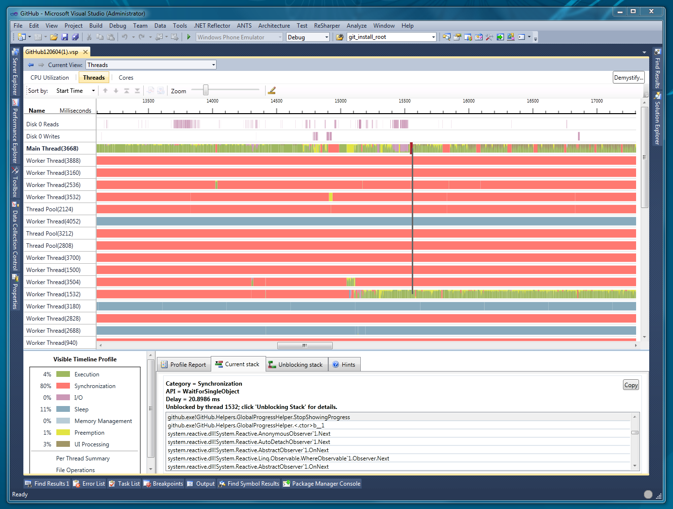
What this is showing is all the threads in my application and the state
that they are in. Generally you want that main UI thread to be green, and
all those places where you see red rectangles is where the UI thread is
waiting on another thread. When the UI thread blocks like that the
application is frozen for the user, so you want to look at what code is
running that is blocking and then what code eventually ran to unblock
the thread. If you want to use this tool yourself, make sure to follow
Paul’s instructions to get real stack traces.
What you don’t see
So far, we’ve really focused on the visual and constructional aspects of
the design, but a lot of our effort in creating GitHub for Windows went
into understanding how to make Git and the distributed collaborative
nature of GitHub accessible to people who have no desire to use a
command line tool. From a design standpoint this means we thought hard
about everything from how you download/install the application to how we
present version control concepts like making a commit or rolling back
changes. We even went so far as to package our own distribution of
msysGit and a curated command-line experience as part of the
application. Design is often most important for the things that you
don’t see.
Written by

Related posts

From pair to peer programmer: Our vision for agentic workflows in GitHub Copilot
AI agents in GitHub Copilot don’t just assist developers but actively solve problems through multi-step reasoning and execution. Here’s what that means.
GitHub Availability Report: May 2025
In May, we experienced three incidents that resulted in degraded performance across GitHub services.

GitHub Universe 2025: Here’s what’s in store at this year’s developer wonderland
Sharpen your skills, test out new tools, and connect with people who build like you.