The Making of Octicons
In our last post we announced Octicons, our new icon font. We put a lot of work into the font and gained a lot of knowledge in the process. With…
In our last post we announced Octicons, our new icon font. We put a lot of work into the font and gained a lot of knowledge in the process. With five different designers working to make it happen, this was one of our bigger collaborations. We thought we’d detail how we built Octicons and what we learned along the way.
Making the Icons
In most cases, a designer would begin to work in Illustrator to create vector icons, but we chose Photoshop as our start place. From the outset we knew we wanted to design icons for specific sizes, so optimizing for those pre-defined pixels was paramount. With the recent release of Photoshop CS6, Photoshop has become a fairly powerful vector tool for pixel projects.
One handy feature that is a little hard to come across, but is great for creating icons is a 2-up view of a file. With the application frame visible Window > Application Frame you can create a second instance of your working document Window > Arrange > New Window For …psd. After that you can have the windows sit side-by-side with Window > Arrange > 2-up Vertical. Each window is a view of the same document, but can be moved and zoomed independently. Best of all, when working with paths in one, the path outlines and handles don’t appear in the other. This lets you work zoomed into one and at 100% to proof your icon in the other.
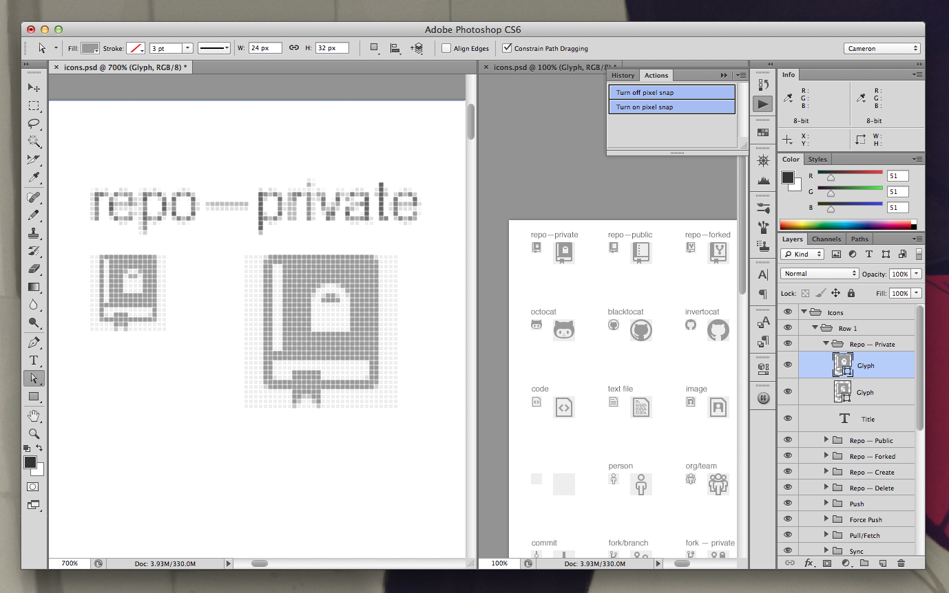
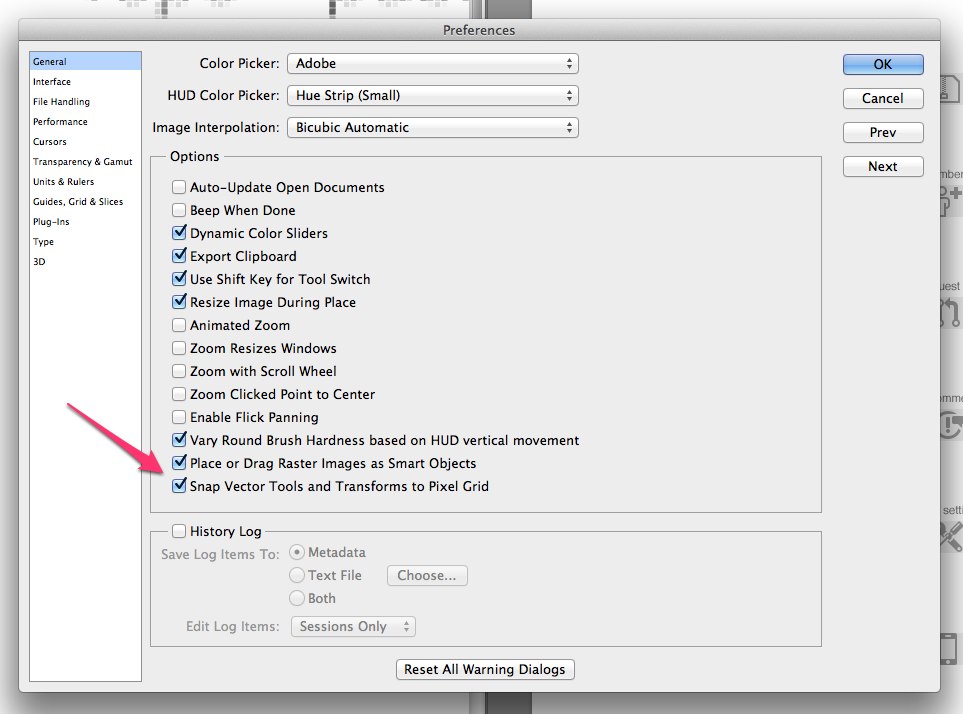
In Photoshop CS6, Adobe introduced pixel snapping vectors. This is an amazing feature if you work with paths a lot. From time to time, however, it’s necessary to turn this feature off. There isn’t a hotkey that does it, but it is possible to record an action for turning this setting on and off which can be hotkeyed.
With Photoshop set up for maximum icon awesomeness, we began to audit all the icons on our site. We created new Octicons for each, as well as adding a few extras we thought might be useful down the road.
Building the Font
![]()
Design is in the details. With all our icons designed, it was time for us to create our font. We decided we needed two sizes of each icon. One size, 16px, would be optimized for its exact size. At 16px the details are limited so every pixel was important. Since the icons were designed for such a small space, they don’t really scale well. To take care of that our second size, 32px, would be designed with more detail so that it could be scaled up for many purposes.
Having planned out or icon strategy, we embarked on the adventure that was putting together our font. For this, we used an application called Glyphs.
To begin, we needed to set up our font file so that it would work with our specific sizes. Since a font technically only has one size, we decided to set it up to be optimized for 32px, with the 16px icons actually scaled down from larger versions.
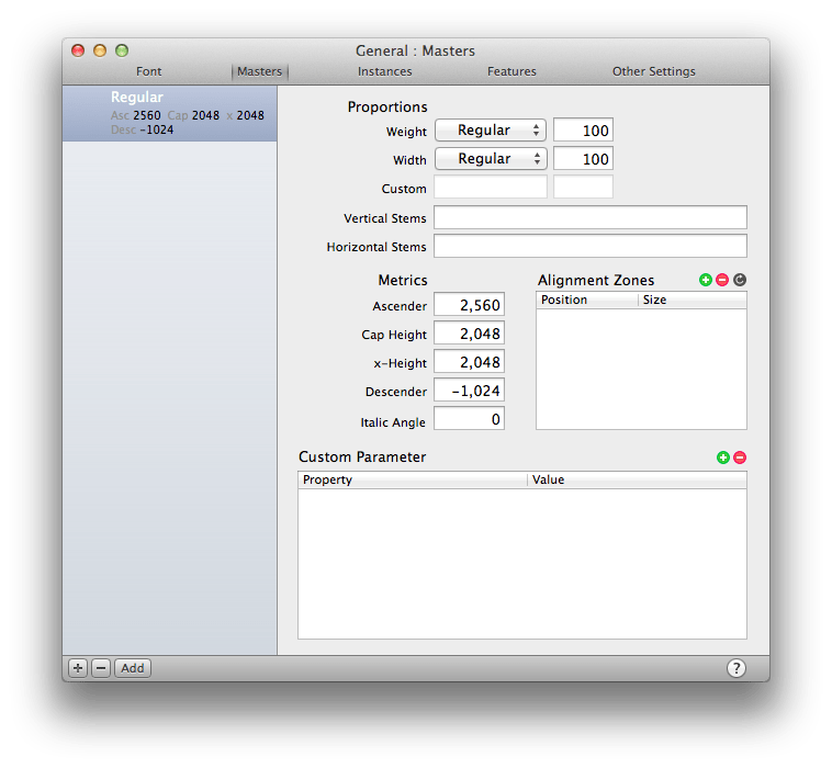
In the case of our icon font, the font’s metrics include a em width, cap height, and grid. This roughly translates to the idea of width, height, and resolution.
We initially tried setting our cap height, x-height, and em width to 32 to make a 32×32 unit square. This technically worked, but we found when exporting the font any nodes not placed on an exact integer unit would be shifted to the nearest unit. This resulted in a lot of ugly icons.
With this knowledge in hand, we decided to adjust things a bit. Using a 2048×2048 unit square, we were able to ensure that when the shifts occurred during export the effect on the overall shape was minor. This was mostly caused by being able to change the ratio of the grid to the total size of the font character. When the nodes snapped to the 1 unit grid in a 32 unit square, the jump was significant. With a 1 unit grid in a 2048 unit square, the jump was far less noticeable.
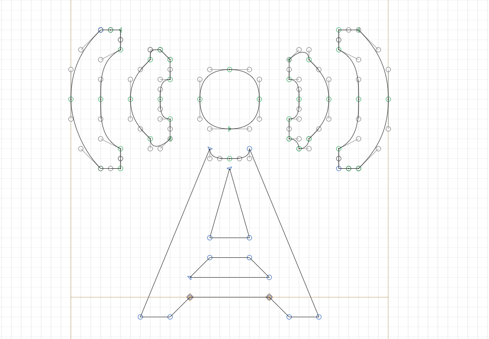
Here are our final metrics in Glyphs.
The flow after we got setup was as follows.
-
Our icons were built in Adobe Photoshop.
Design your icons in whatever you’re comfortable with. Building it in Photoshop did add an extra step, but we preferred the control it gave us.
-
We scaled in Adobe Illustrator to 2048 units.
We first opened the Photoshop file in Illustrator. When copying the paths out of Illustrator, Glyphs seemed to use Illustrator’s coordinates for positioning. Having all the icons on one sheet, this caused alignment issues when simply copying and pasting icons into Glyphs.
To resolved this, we created a second 2048×2048 document. To get Illustrator to match Glyphs’ grid, we had to shift the ruler zero point -1792pts. We then copied in a character (enclosed in a 2048×2048 square) into the new document and ran an action that scaled it up to fill the document and set it to (0,0). From here we were able to copy the vector path into Glyphs in the correct position.
This process was repeated for every character. In the end, each character fits a 32px square, sitting 4px below the baseline to line the icon up with any text it is pared with.
-
We exported our font as an
OTF.
You may ask yourself why we chose 2048 as our magic number. We did quite a few tests at other sizes like 512 and 1024. What we found is that the size of the characters didn’t have much of an effect on the file size. What did change it was the grid size ratio. The larger the grid size (fewer grid squares), the smaller the file size got. At 2048 units, we had much more flexibility to adjust the grid scale without impacting the shapes of the font. In the end we chose a grid of 32px, which resulted in a 20% smaller file on export than a grid of 0 units. Larger grids like 64 units and 128 units, produced files that, while slightly smaller, didn’t reduce the file size enough to make it worth the loss of vector quality.
-
We uploaded the exported
.otffile to the Font Squirrel @font-face generator.Since we didn’t want any of the standard characters and used our own special unicode characters, we specified our own subset range, and turned pretty much everything off. You can grab our config settings here.
With our font built and ready for the browser there were a few items left we had to polish before calling the icons complete.
Sub-Pixels
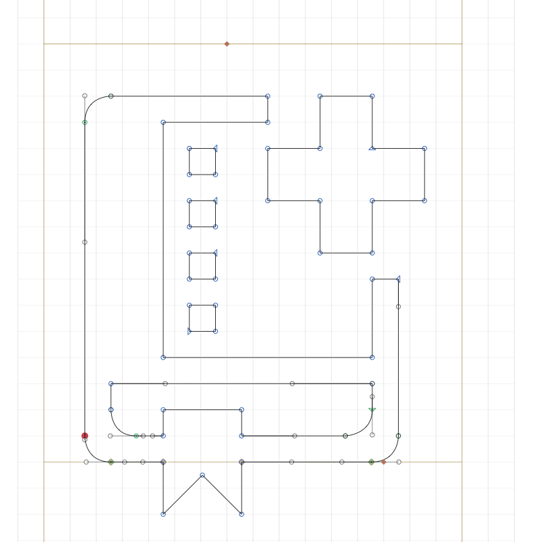
The grid matters! Each one of the grid squares above represents a pixel in Glyphs. This is equal to 128 units in the app (We actually used a 32 unit grid, but this helps illustrate our point). When the lines don’t line up with this grid, the font rendering engine tries to compensate. It does this by aliasing which renders the half pixels as grey pixels. The Create New Repo icon above is mis-aligned. The result is below.
Not Aligned

Aligned

Fine Tuning
The last thing our font needed was a little something-something to adjust how the font was aliased. WebKit’s -webkit-font-smoothing property was our answer.
Subpixel-antialiasing
![]()
Browsers use subpixel rendering by default. This looks great for text, but left the icons looking a little heavy as a result of the extra pixels it adds.
No antialiasing
![]()
By turning off font-smoothing entirely, we could preserve every pixel perfectly. This was great for straight lines, but curved or angled lines ended up looking blocky and pixelated.
Antialiasing
![]()
Antialiased text was a good middle ground. It provided both the sharp edges when the font was built correctly, and smooth, lightweight curves when they were needed.
While only a feature of WebKit at this point, we’ll update the icons to support font-smoothing in other browsers as it becomes available.
Credit
We’re pretty proud of these icons. They are the result of a lot of hard work from @bryanveloso, @jonrohan, @jasoncostello, @kneath, and @cameronmcefee. We hope you’ve found this breakdown of the process interesting.
Written by

Related posts
GitHub joins coalition advocating for fixes to California AI Transparency Act to protect open source
We’re calling for targeted amendments to resolve conflicts with open source licensing and align with international transparency frameworks while preserving regulatory intent.

GitHub availability report: May 2026
In May, we experienced nine incidents that resulted in degraded performance across GitHub services.
GitHub Universe is back: All together now, in the agentic era
GitHub Universe is back: returning to the historic Fort Mason Center in San Francisco on October 28–29, 2026.